
A brand identity is more than a logo or a carefully chosen colour palette. It is the sum of the details that shape how people experience a business, from the first glimpse of a shopfront to the bag they carry home. When these elements work together, even the smallest touchpoint can become part of a recognisable whole.
For Studio Vanne, the challenge was to create an identity that felt refined without becoming predictable. Through an unexpected colour combination and a series of considered applications, we built a visual language that brings personality to every interaction with the brand.
A palette with a twist
Some colour combinations feel familiar from the start. Others reveal their character through contrast. For Studio Vanne, we paired deep burgundy and dark brown with an unexpected light blue, balancing a sophisticated foundation with a playful accent.
The darker tones bring depth and warmth, while the light blue introduces a sense of surprise. The burgundy tones clearly lead the identity, establishing its depth and sophistication, while the light blue acts as a refined, playful surprise that adds contrast without competing for attention.
We wanted this contrast to reveal itself gradually. At first glance, the identity feels refined and understated; look a little closer, and the lighter accent brings a different personality to the surface. This balance became an important part of the visual language, allowing the brand to feel sophisticated without taking itself too seriously.
An identity that you can take home
Packaging offers an opportunity to leave the digital and physical environment of a store behind and become part of someone’s everyday life. For Studio Vanne, we treated these objects as extensions of the identity rather than practical necessities.
We explored this through two distinct shopping bags. A custom-shaped canvas bag gives the identity a more individual silhouette, while the paper shopping bag brings the palette and material contrasts together. Deep burgundy is paired with glossy foil, with a light-blue cotton cord introducing a subtle but unexpected detail.
The result is packaging that does more than carry a purchase. It gives the identity another place to be experienced, remembered and recognised beyond the store itself.
A gift in its own right
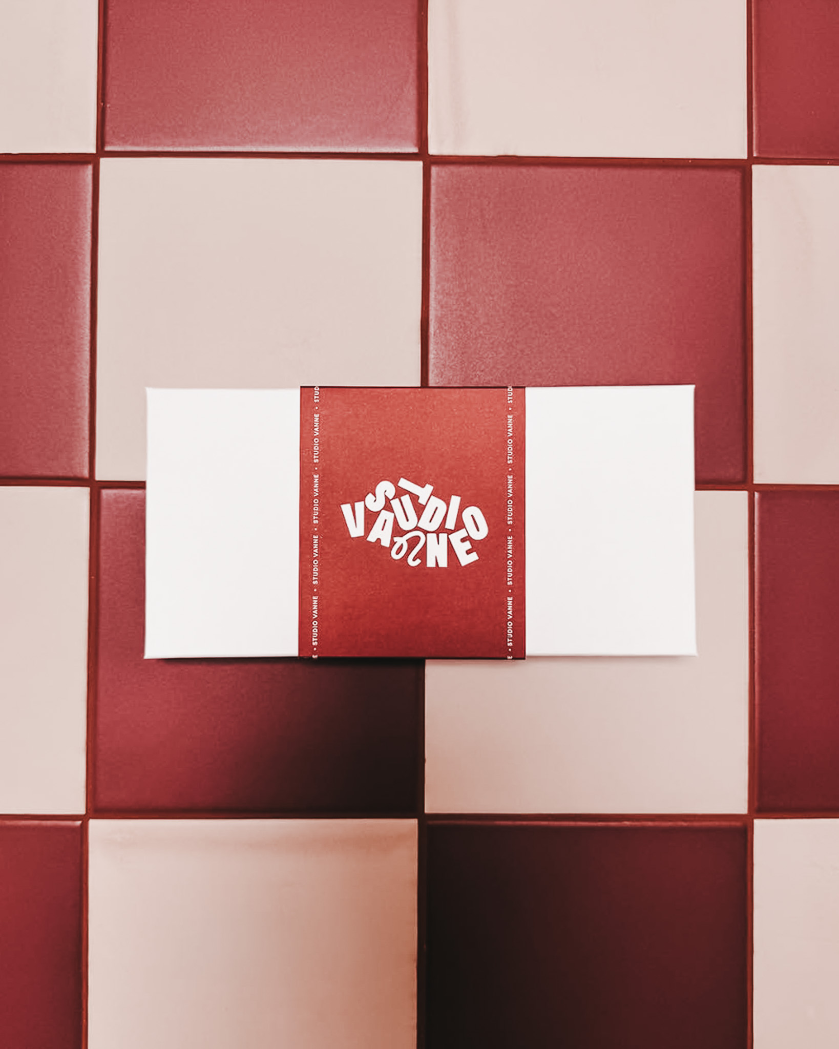
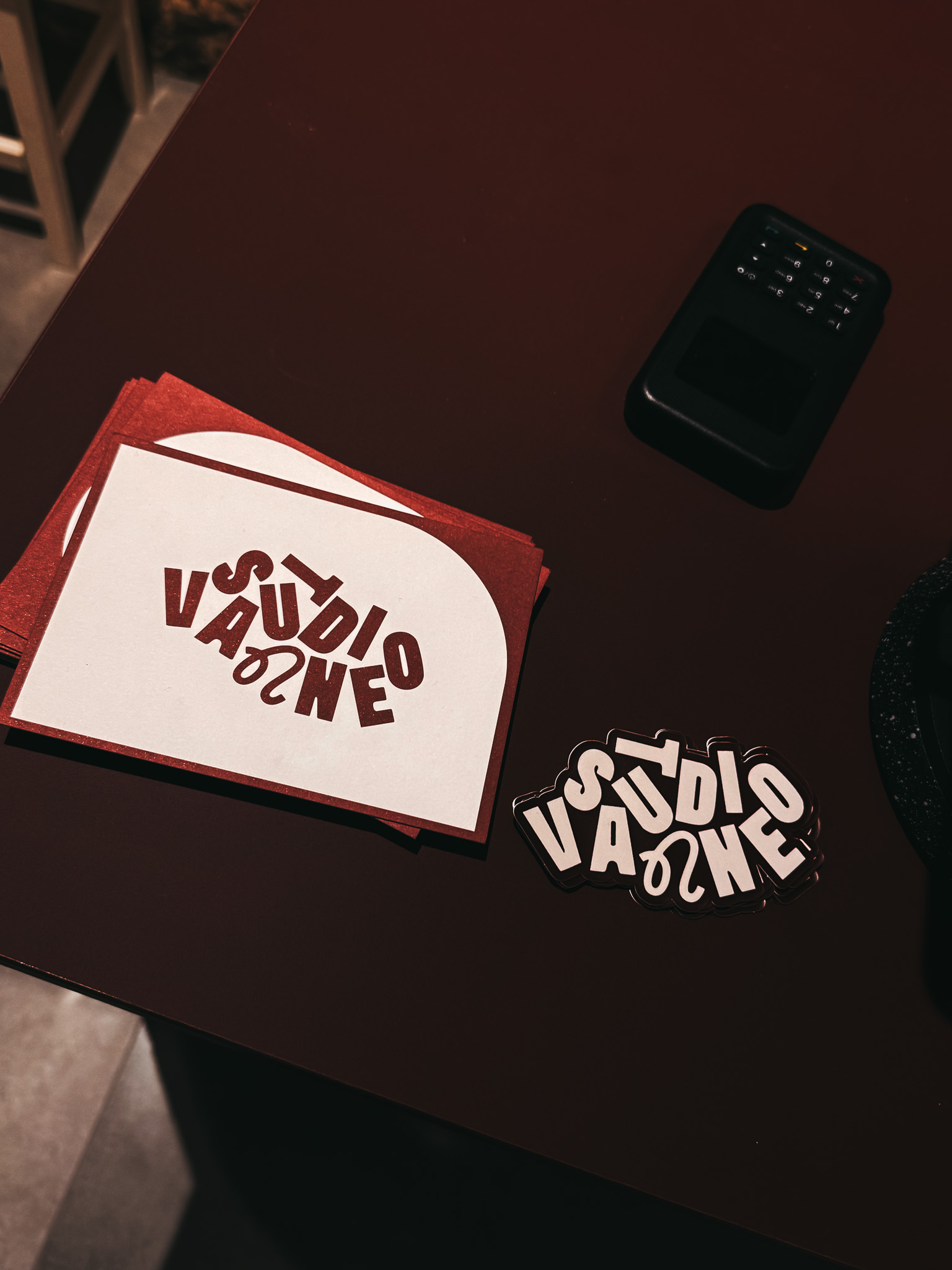
The same attention to detail extends to Studio Vanne’s gift card. Rather than treating it as a simple printed voucher, we approached it as an object in its own right.
An off-white box provides a quiet starting point, complemented by a burgundy sleeve and matching burgundy on the inside. The layered presentation turns a practical item into a small, considered experience, with the act of opening it becoming part of the gift itself.
It’s a good example of how print development can add value beyond the printed item itself. The choice of paper, colour and presentation influences how something is received and experienced. By thinking about the entire object rather than just the card, we could give this touchpoint its own character while keeping it connected to the wider identity.
A first glimpse behind the window
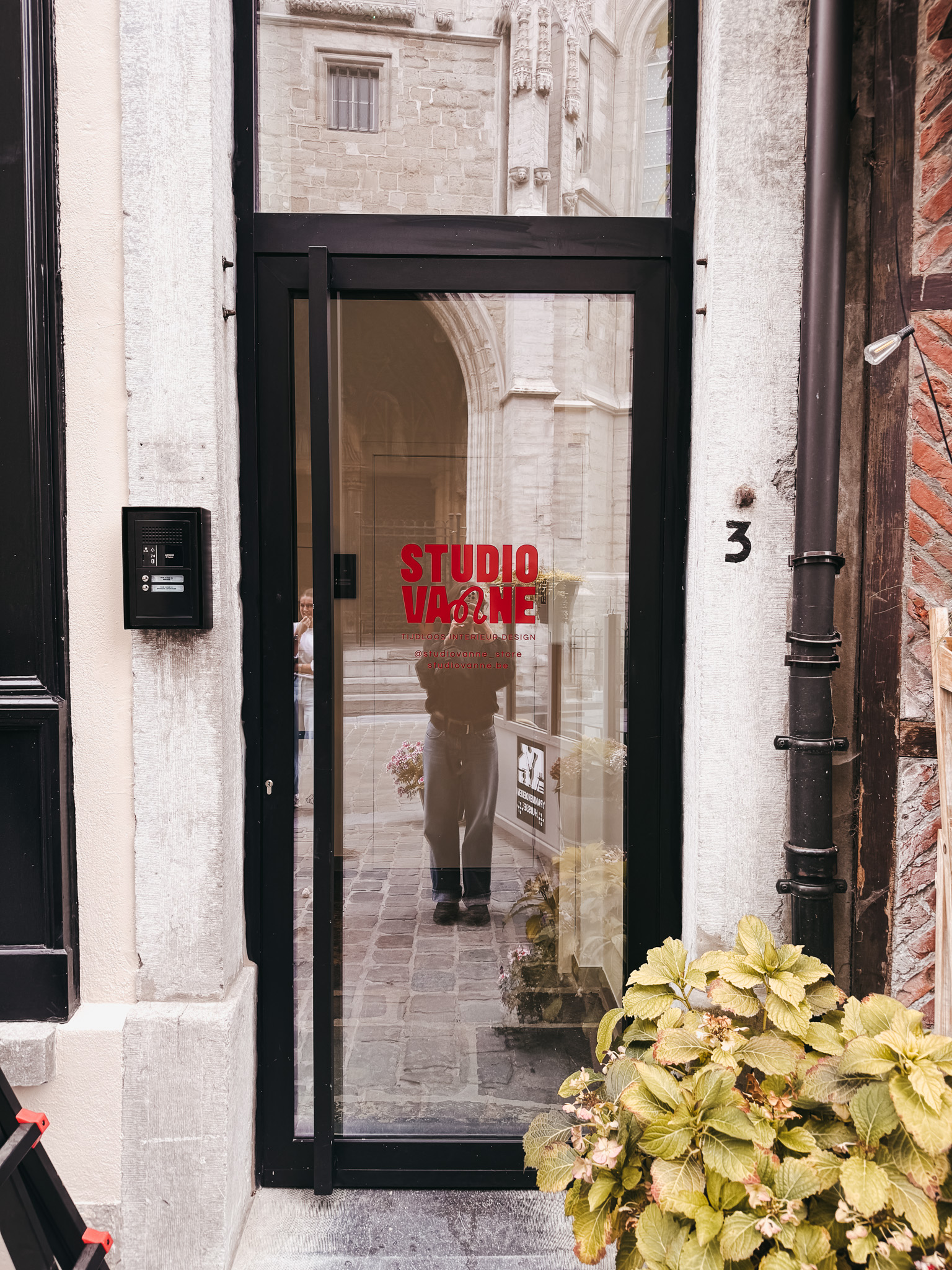
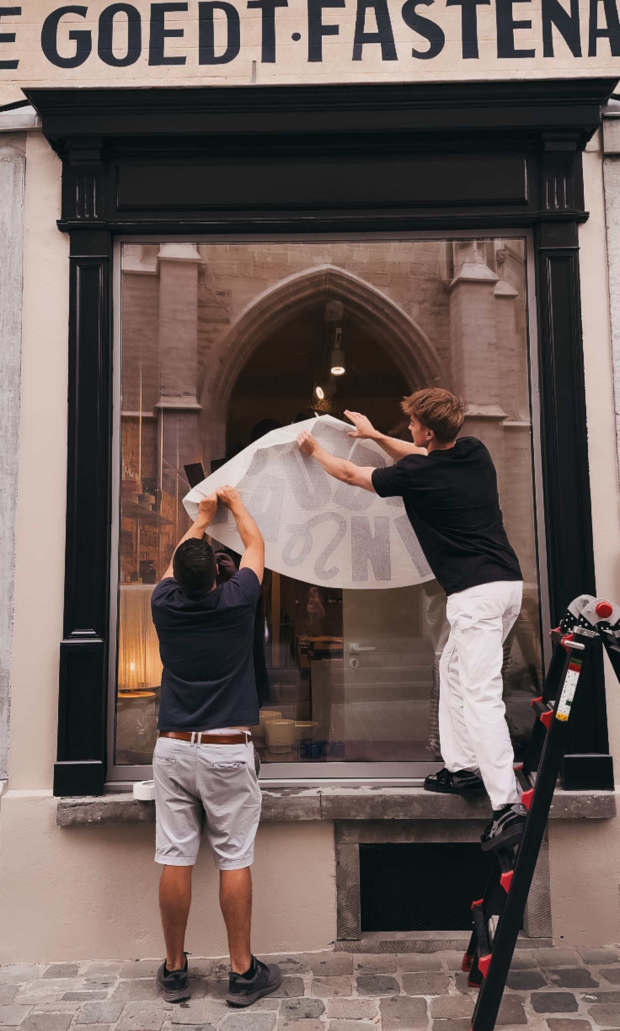
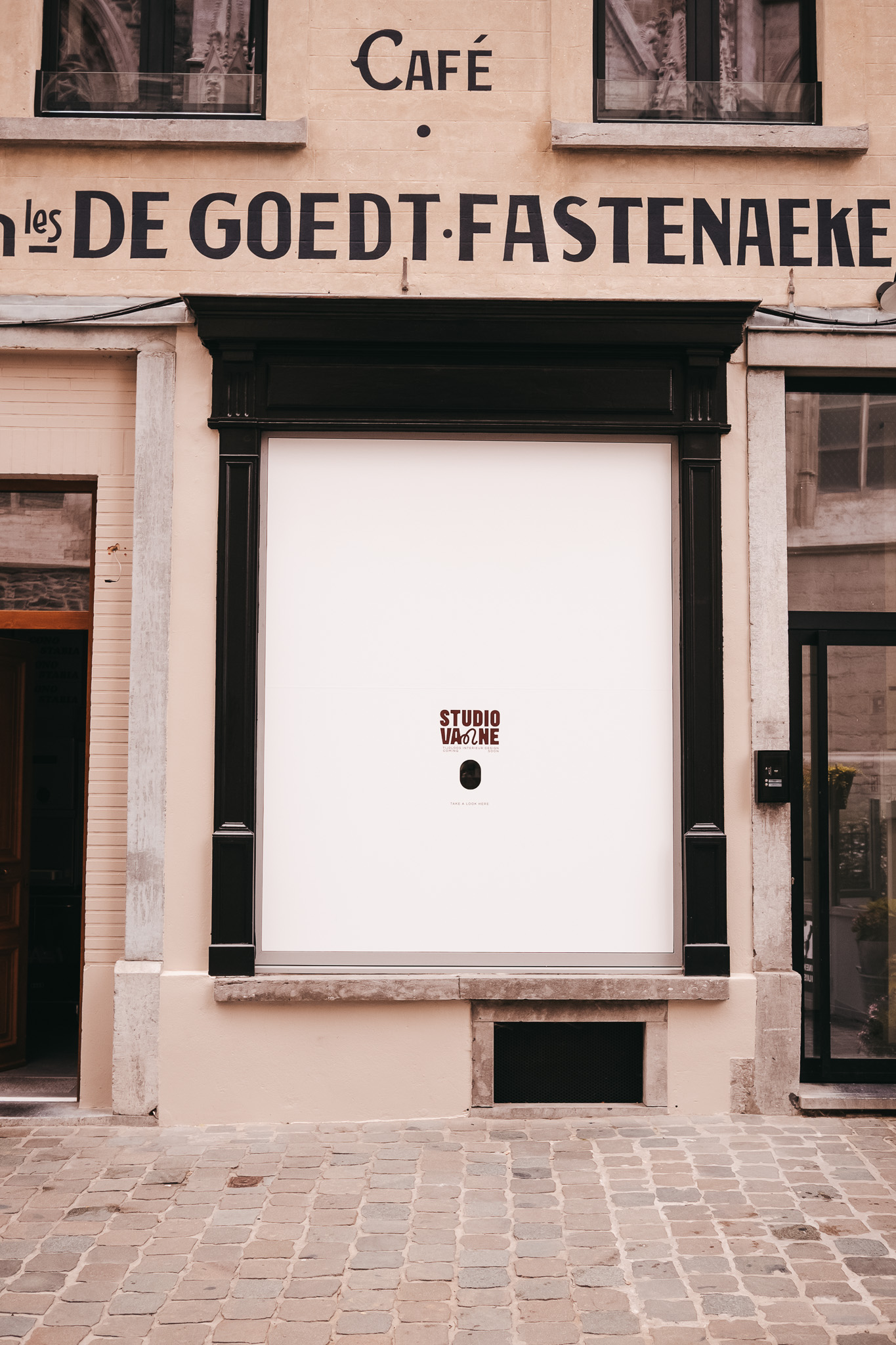
A brand’s story can begin before its doors open. For Studio Vanne, the Coming Soon window offered a way to turn the anticipation surrounding the new store into part of the experience.
We incorporated a viewing hole through which passers-by could take a sneak peek. It turned a temporary window display into a small moment of interaction, giving people a reason to pause and look beyond the façade.
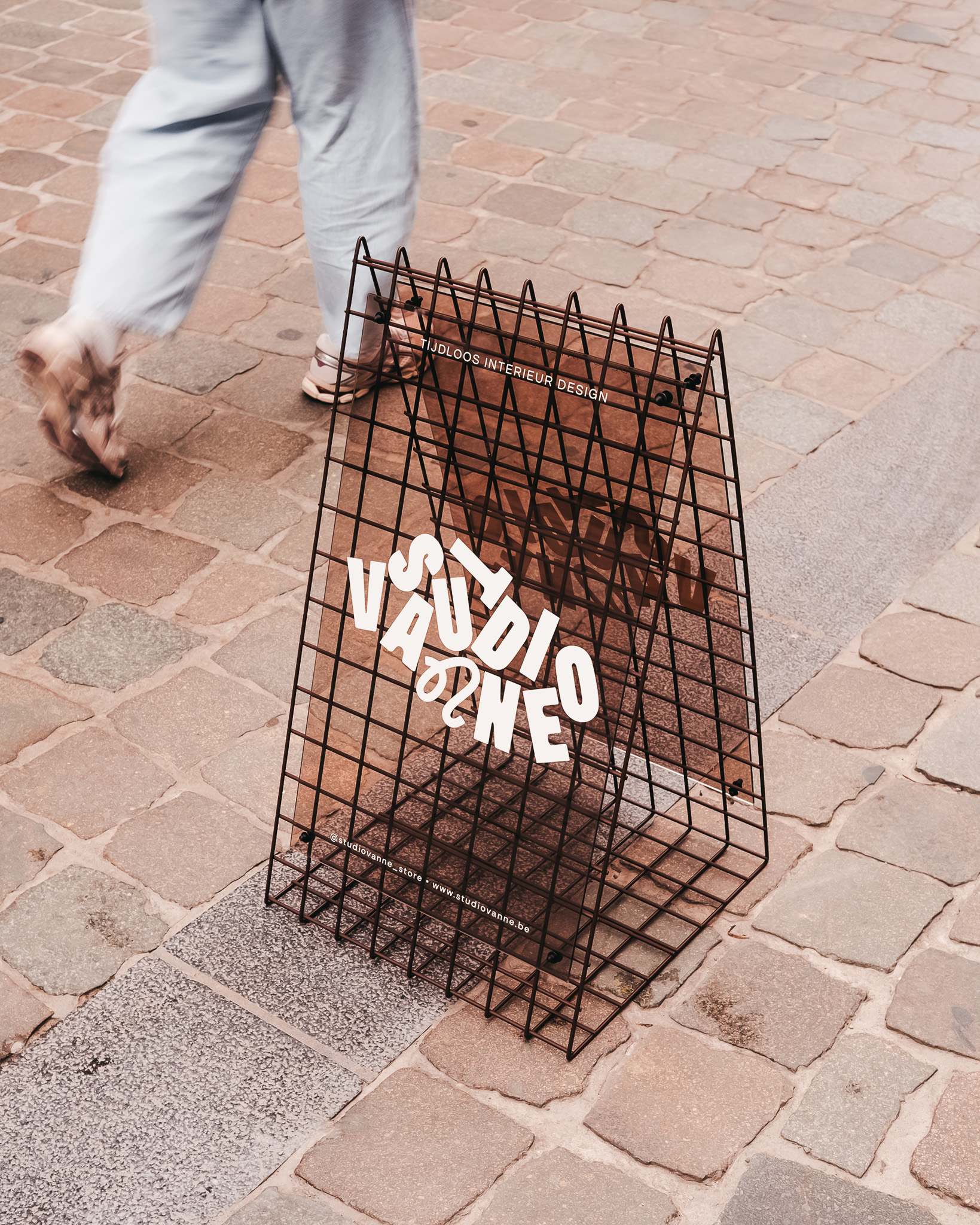
The sidewalk sign continued the visual identity into the street, using brown plexiglass with ivory lettering. The choice of materials gives the sign its distinct presence while keeping it connected to the rest of the visual language.
Together, these applications show how brand building extends beyond the assets a business uses in its day-to-day communication. The physical environment can become part of the identity, too. By considering how people encounter the brand in the lead-up to the opening, we could make the experience feel connected from the very first interaction.
One identity, many touchpoints
From the colour palette to the packaging, gift card and shopfront, each element of Studio Vanne’s identity serves a different purpose. What connects them is the same considered approach to colour, material and detail.
This is where brand building and print development come together. Establishing the identity is only the beginning; translating it into tangible applications is what allows people to experience it in different contexts. We approach these disciplines as connected parts of the same process, making sure that each expression has a purpose while contributing to the overall brand.
For Studio Vanne, the result is an identity that feels cohesive without becoming repetitive. The visual language remains recognisable, but its expression changes depending on the object, material or setting. We believe a strong brand doesn’t need every touchpoint to look identical; it needs every touchpoint to feel like it belongs.