HIGH-END, WITH A TWIST
Studio Vanne is an interior and furniture store that opened in September 2026. The identity needed to feel refined, without falling into the familiar codes of high-end interiors. We paired deep shades of burgundy and dark brown with an unexpected touch of light blue, creating a visual world that feels sophisticated at first glance, but reveals a more playful side in the details.
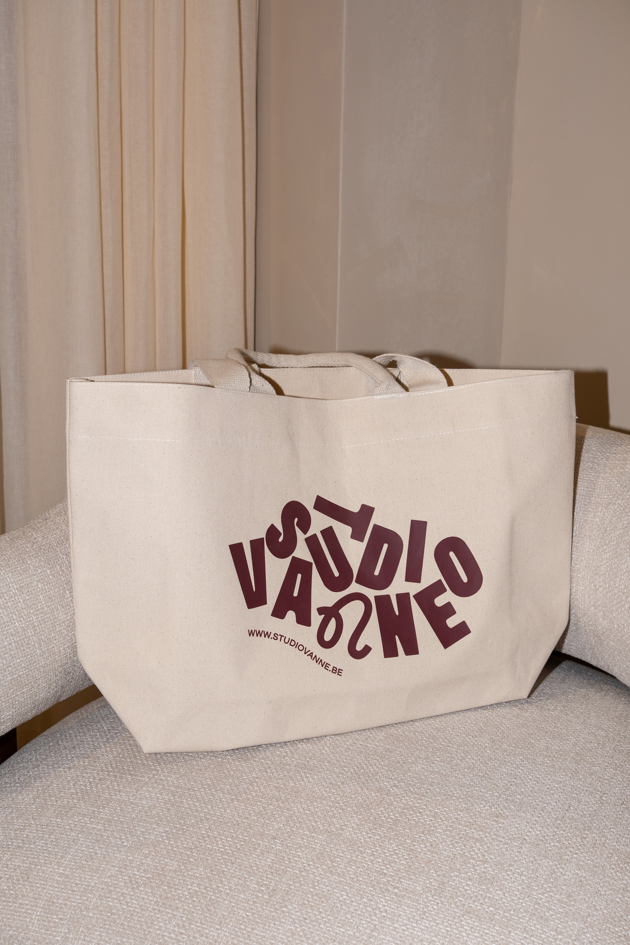
The canvas bag, shaped to hold different purchases.
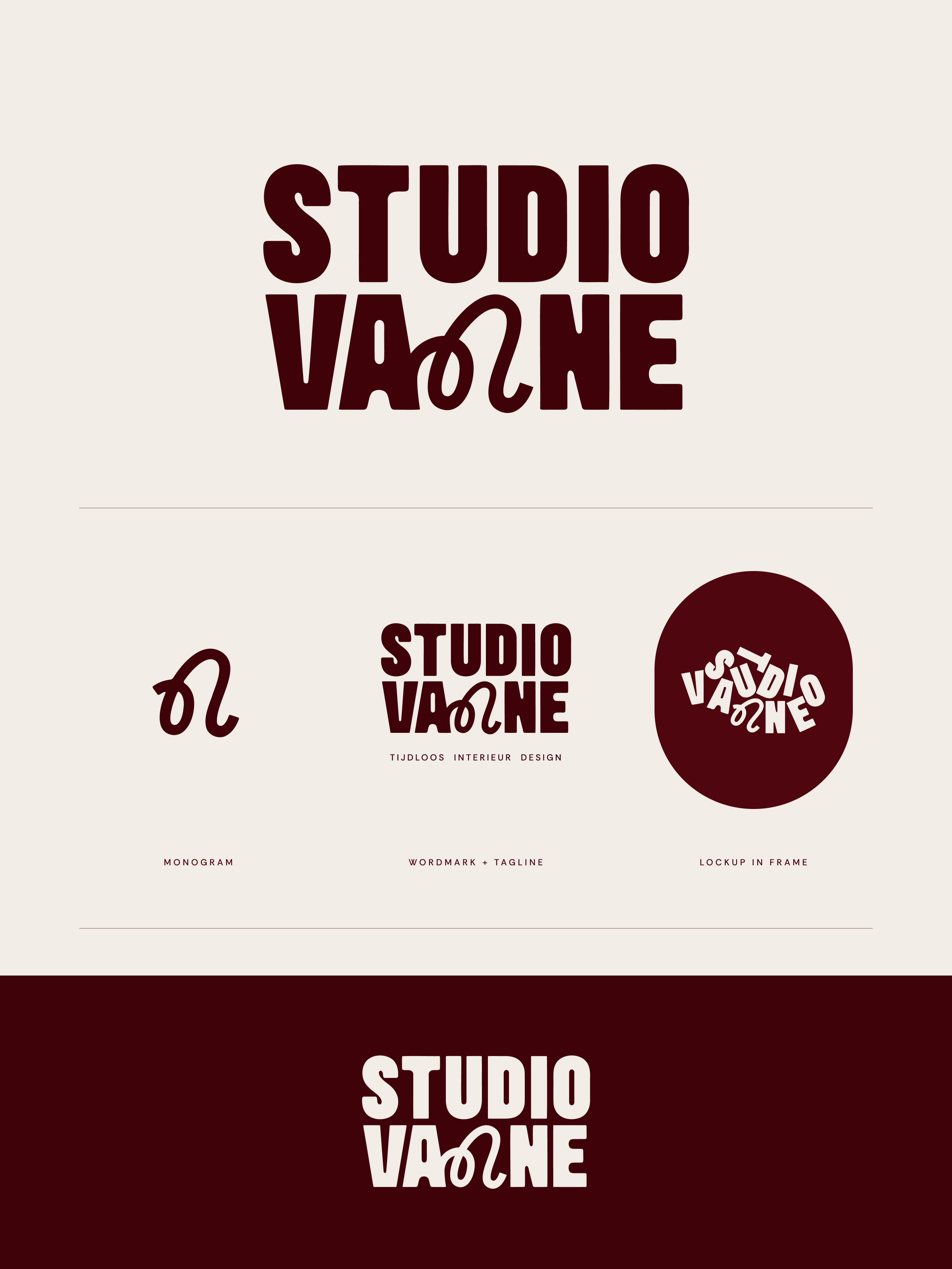
The logo system: monogram, wordmark and lockup.
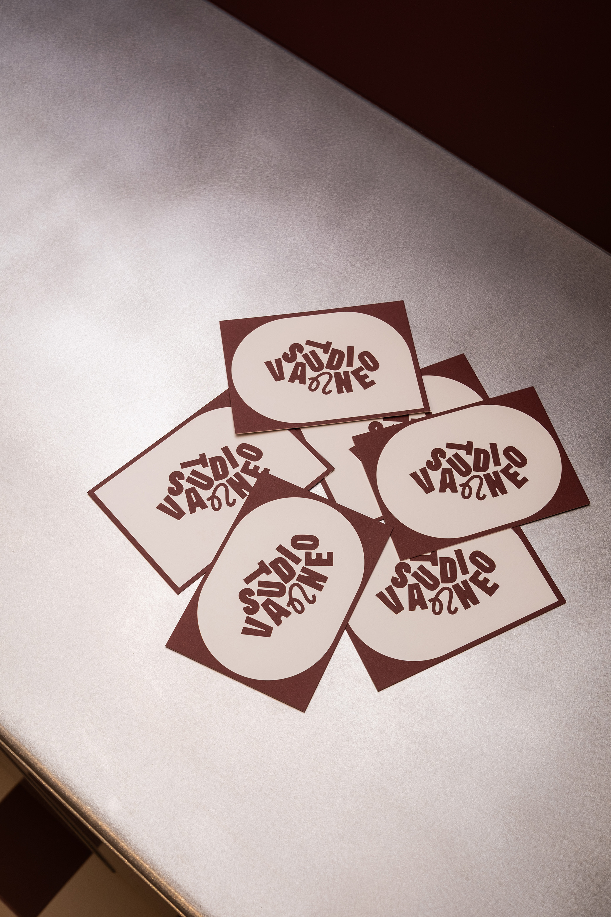
Marketing cards, designed in different shapes.
AN IDENTITY YOU CAN TOUCH
For Studio Vanne, print and packaging became as important as the logo itself. A custom-shaped canvas bag was designed to accommodate different purchases, while the paper bag combines burgundy with transparent, glossy foil and a contrasting light blue cotton cord. Substantial paper stocks, reflective surfaces and unexpected material combinations turn even the most functional touchpoints into recognisable pieces of the identity.

Card shapes, and the Coming Soon window design.
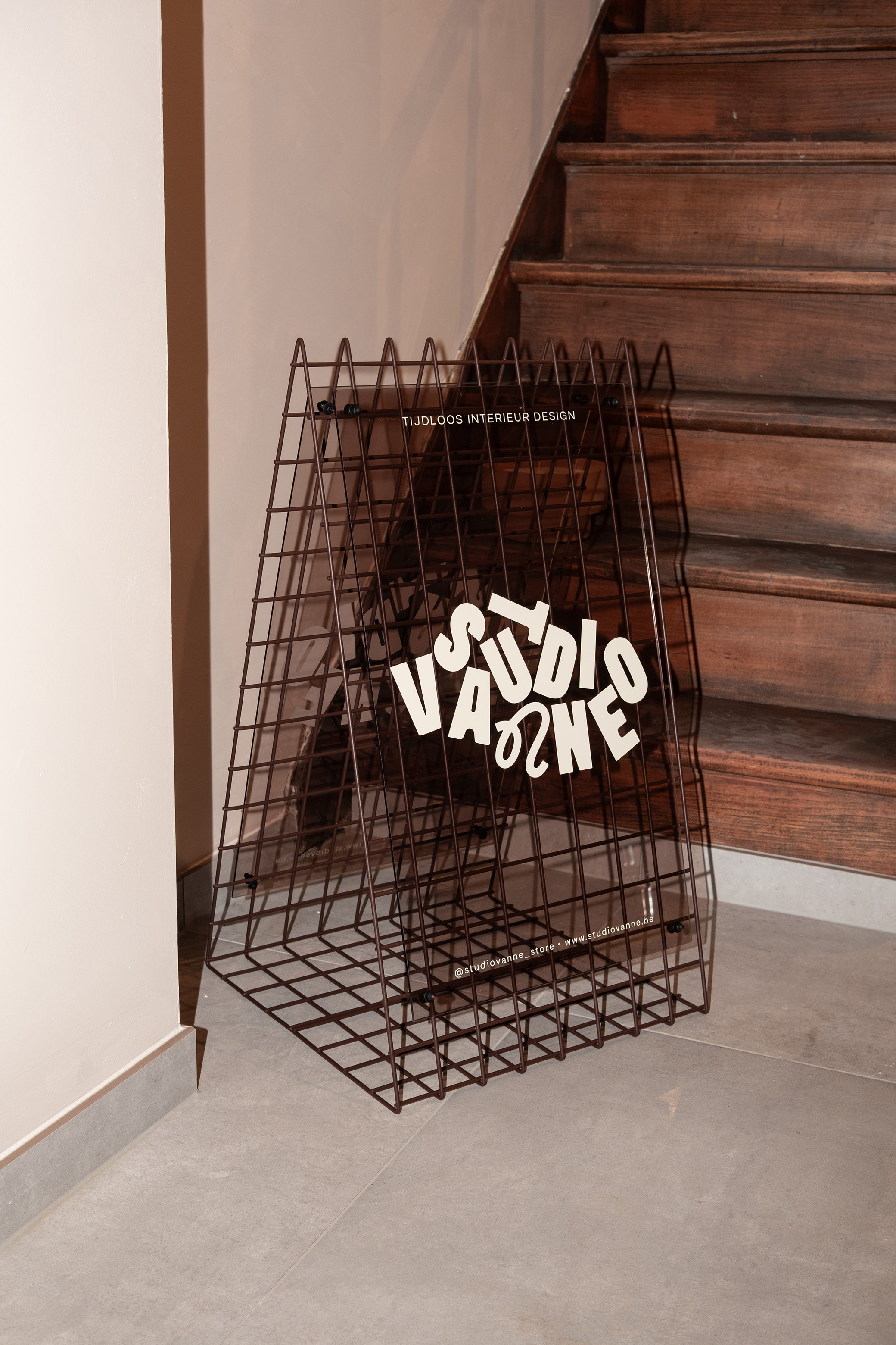
The sidewalk sign: grid, plexiglass and ivory lettering.
MORE THAN A GIFT CARD
The gift card was treated as an object rather than a voucher. It comes in an off-white box, wrapped with a burgundy sleeve and opening onto burgundy paper inside. The different layers make receiving and unwrapping it part of the experience. It’s a small-scale expression of the wider Studio Vanne identity: considered and tactile, with attention given to what you see, hold and uncover.
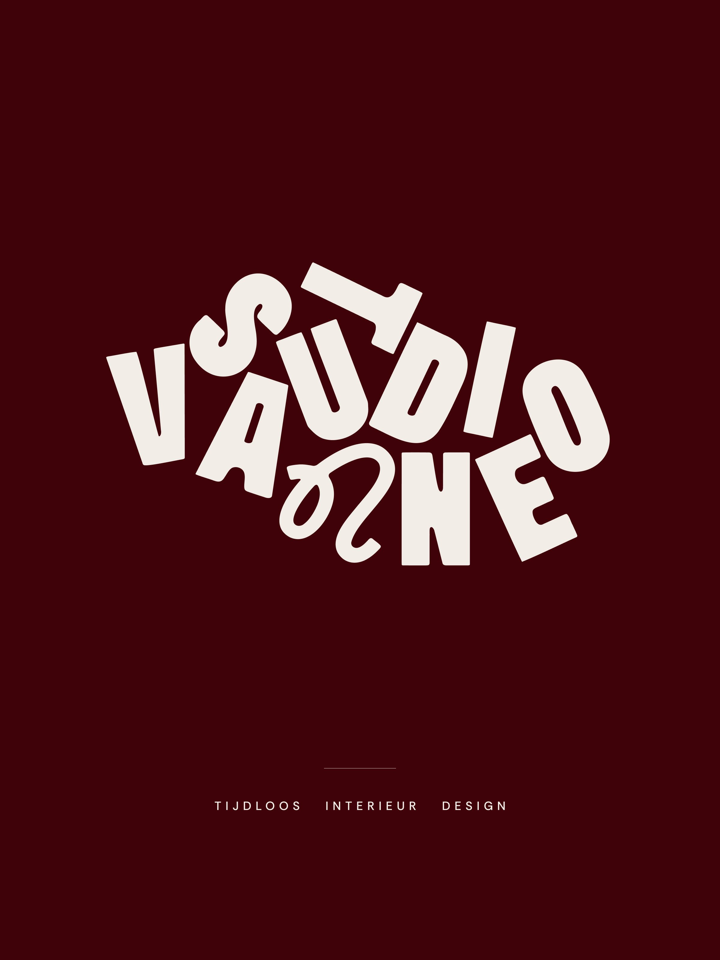
The logotype with its tagline, ivory on burgundy.
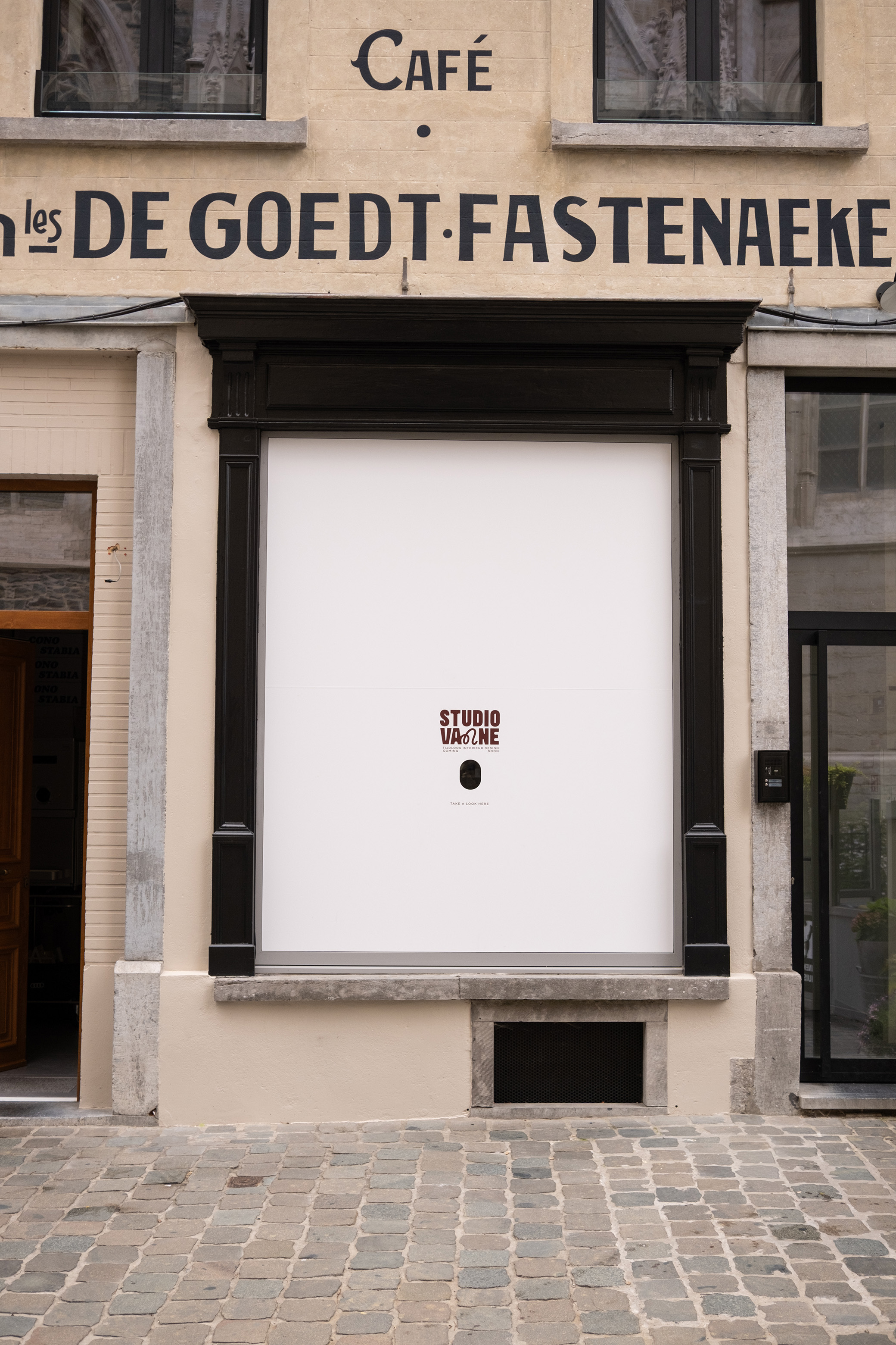
The Coming Soon window, with a hole to look through.

Questrial and Rethink Sans, the type pairing.
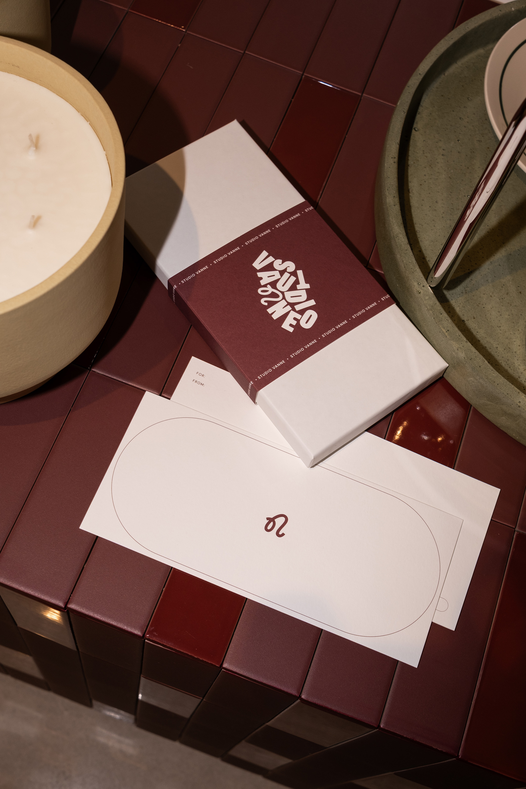
The gift card, boxed and sleeved.
FROM WINDOW TO SIDEWALK
The identity also moves into the physical space around the store. While construction was underway, the Coming Soon window included a viewing hole that invited passers-by to peek inside and watch the space take shape. For the opening, transparent burgundy foil is paired with a shiny finish for the N, playing with transparency and reflection. Even the sidewalk sign becomes an object of its own, combining a grid structure, brown plexiglass and matte ivory lettering.
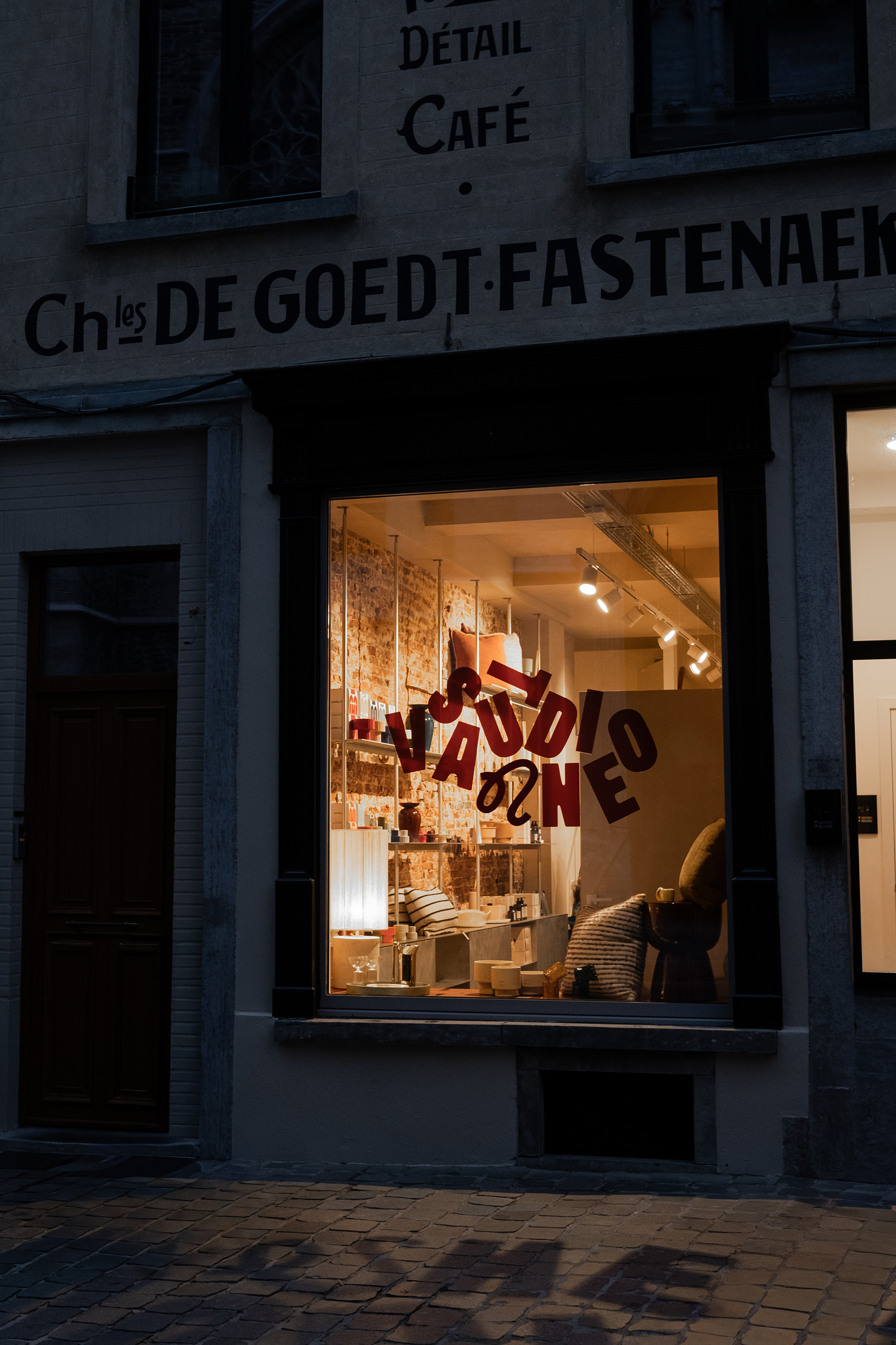
The window at night, burgundy foil on glass.
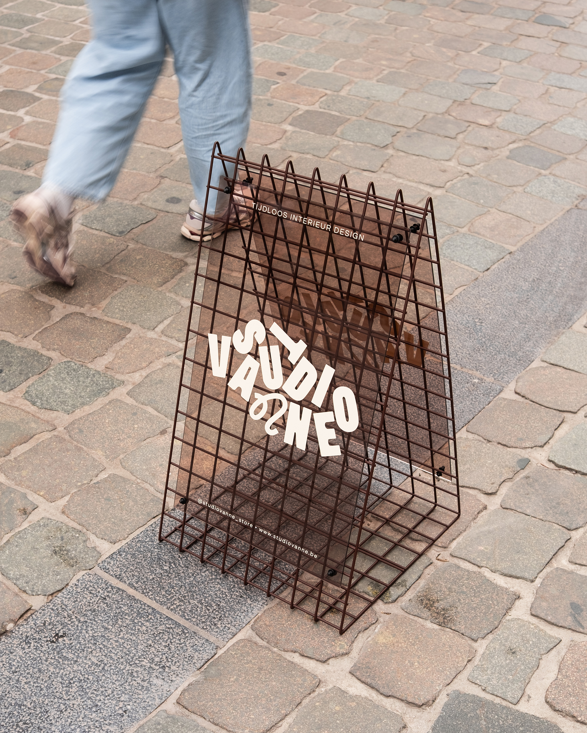
The sidewalk sign, out on the cobbles.
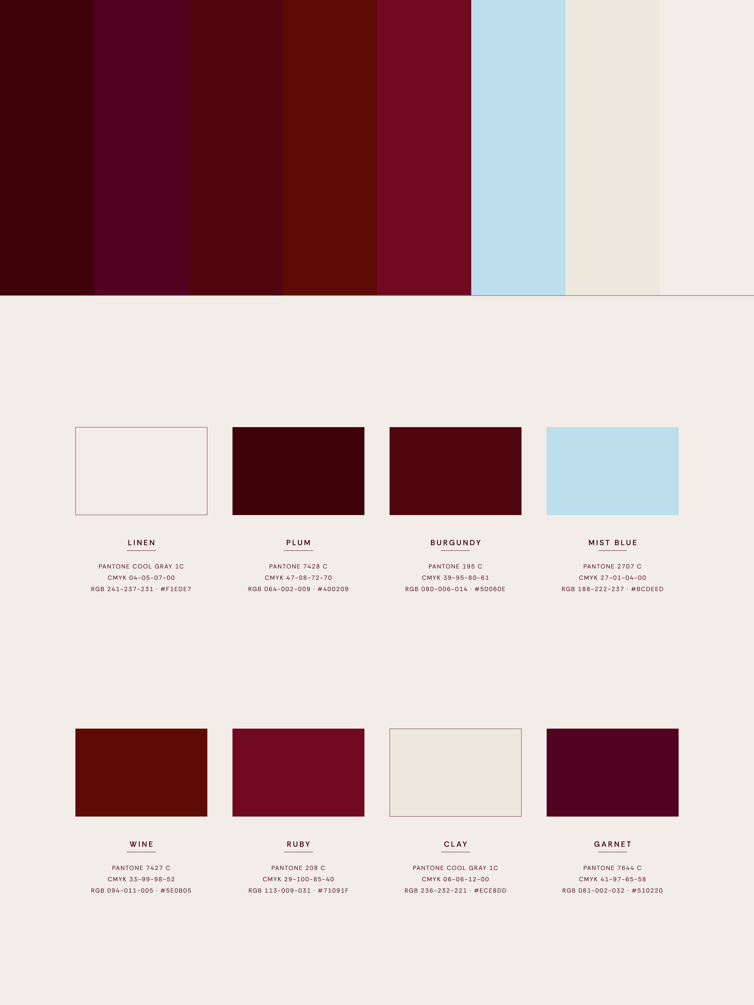
The colour system: linen, plum, burgundy and mist blue.
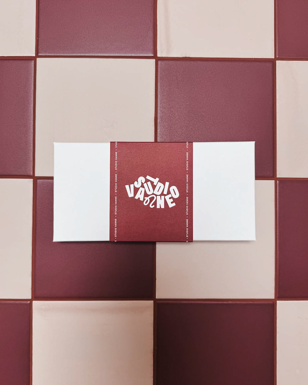
Off-white box, burgundy sleeve.
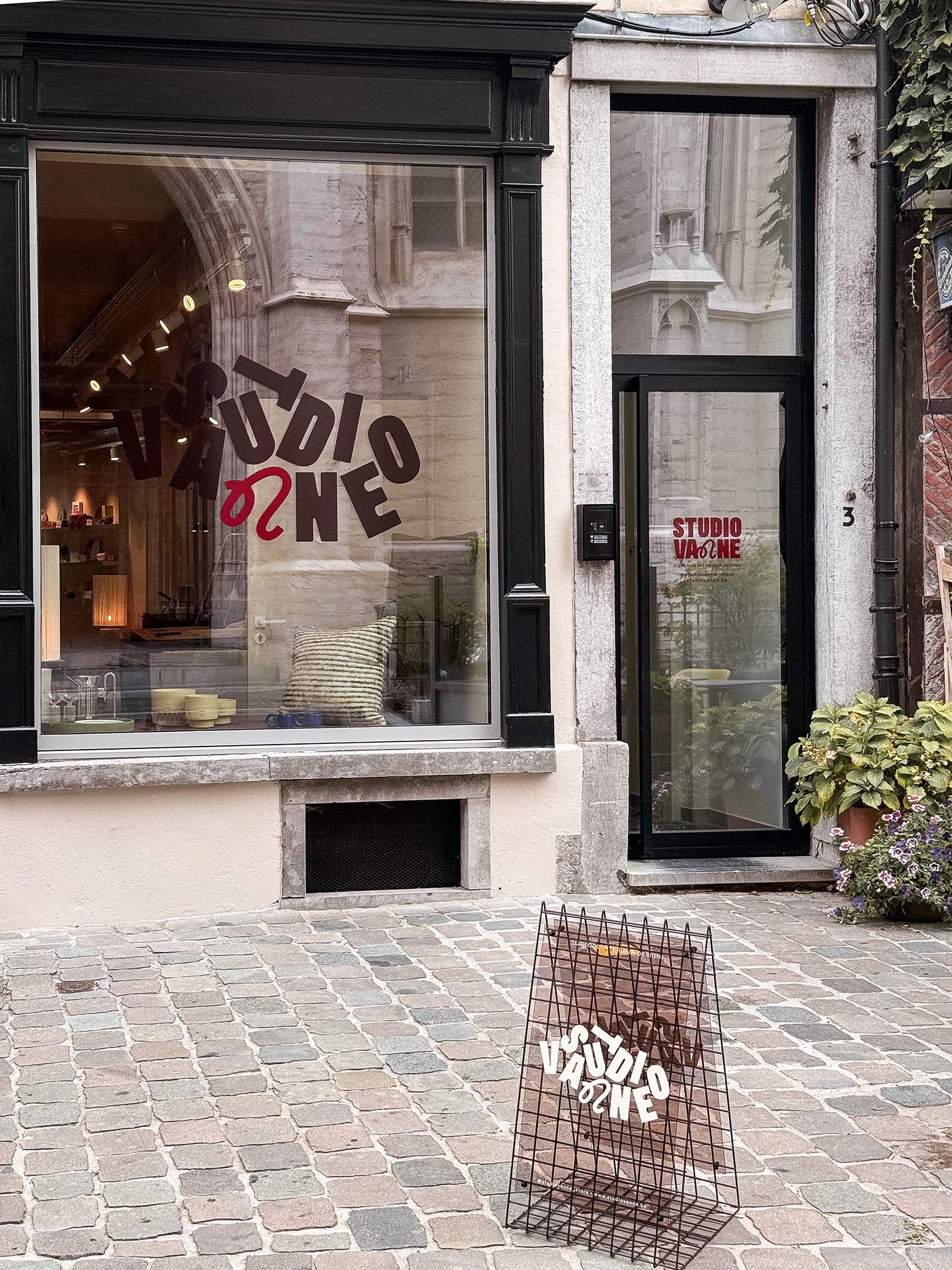
The storefront, window and sign together.
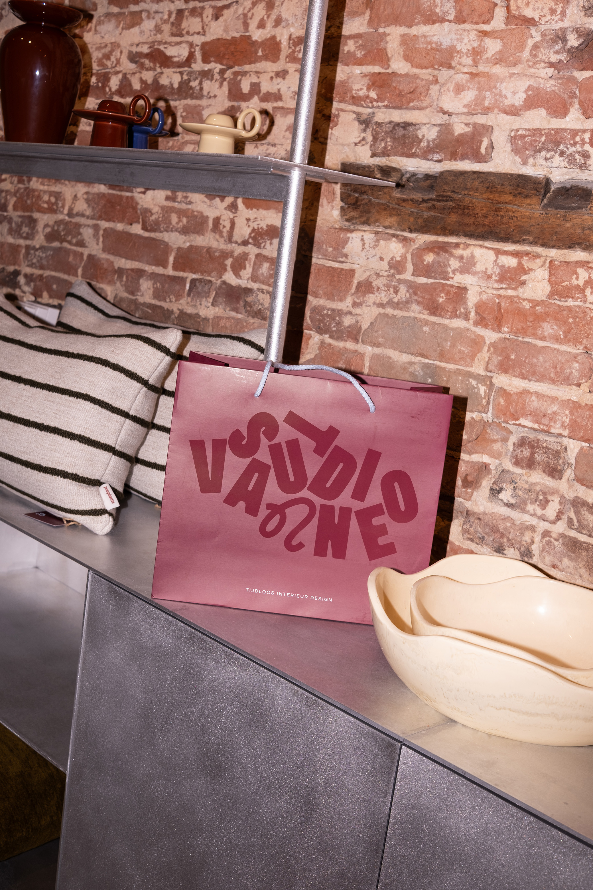
The paper bag: burgundy, glossy foil, light blue cord.
Brand Identity
Solena Greco, Matti Verbanck
Graphic Design
Solena Greco, Matti Verbanck
Photography
Solena Greco
Print Production
Lamine
Signage Production
Shannon