
GIVING THE BRAND CLARITY
Sill and Sound came to us with an identity that had started to lose consistency across applications. Rather than reinventing the brand, we refined what was already there. The logo was redrawn into a more coherent system, with different configurations for different contexts. The result is understated and precise, giving the architecture room to remain the focus.

sillandsound.com - a digital experience
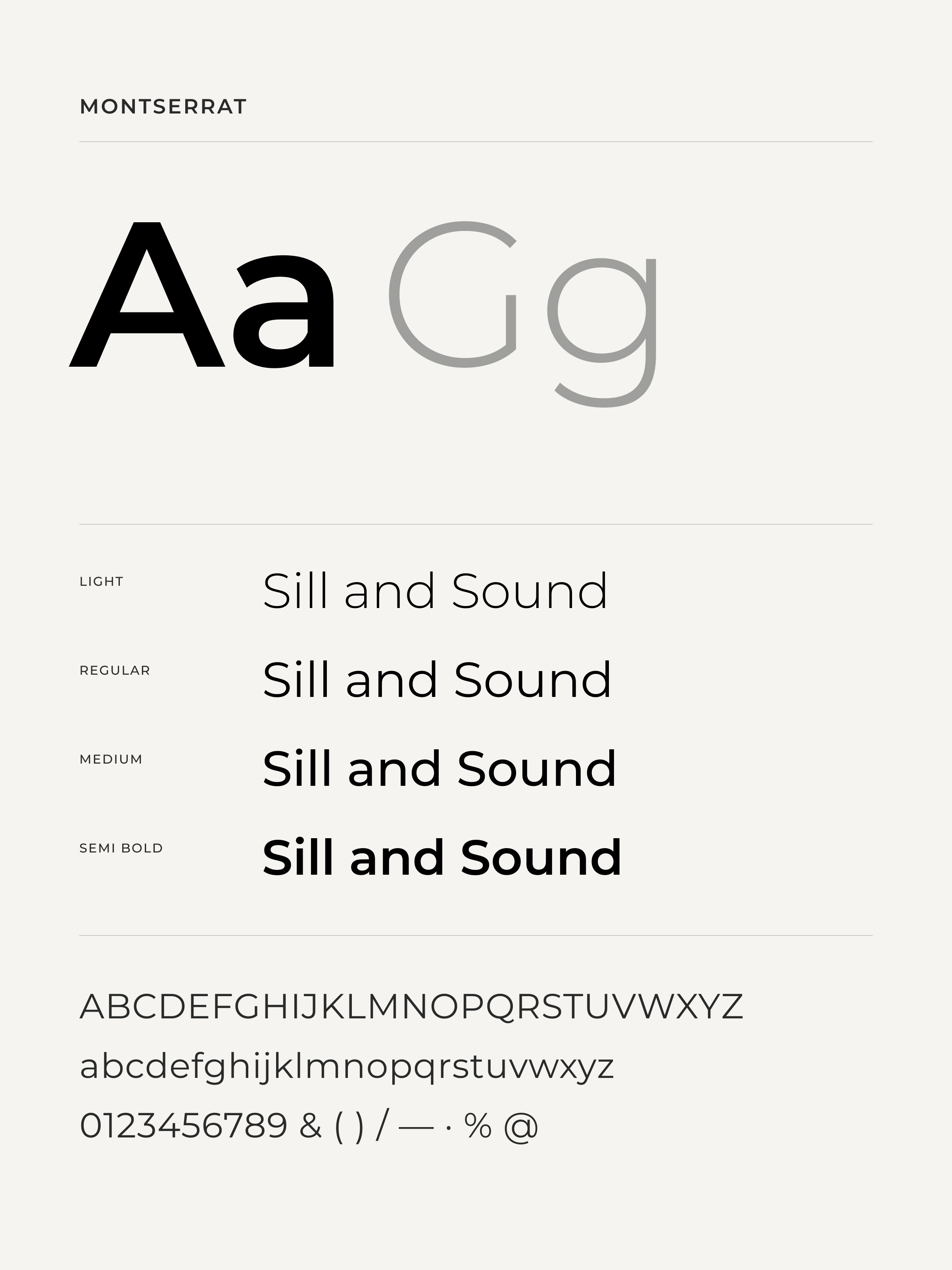
Montserrat, used across all supporting text.
The primary logotype, Sill and Sound.
QUIET BY DESIGN
The visual language stays deliberately neutral. A monochrome palette of black, ivory, white, ash and silver creates a balance between cool precision and warmth. Courier New brings a distinctive editorial character to headlines, while Montserrat keeps supporting text clear and accessible. Together, the system feels timeless without becoming tied to a specific architectural style.
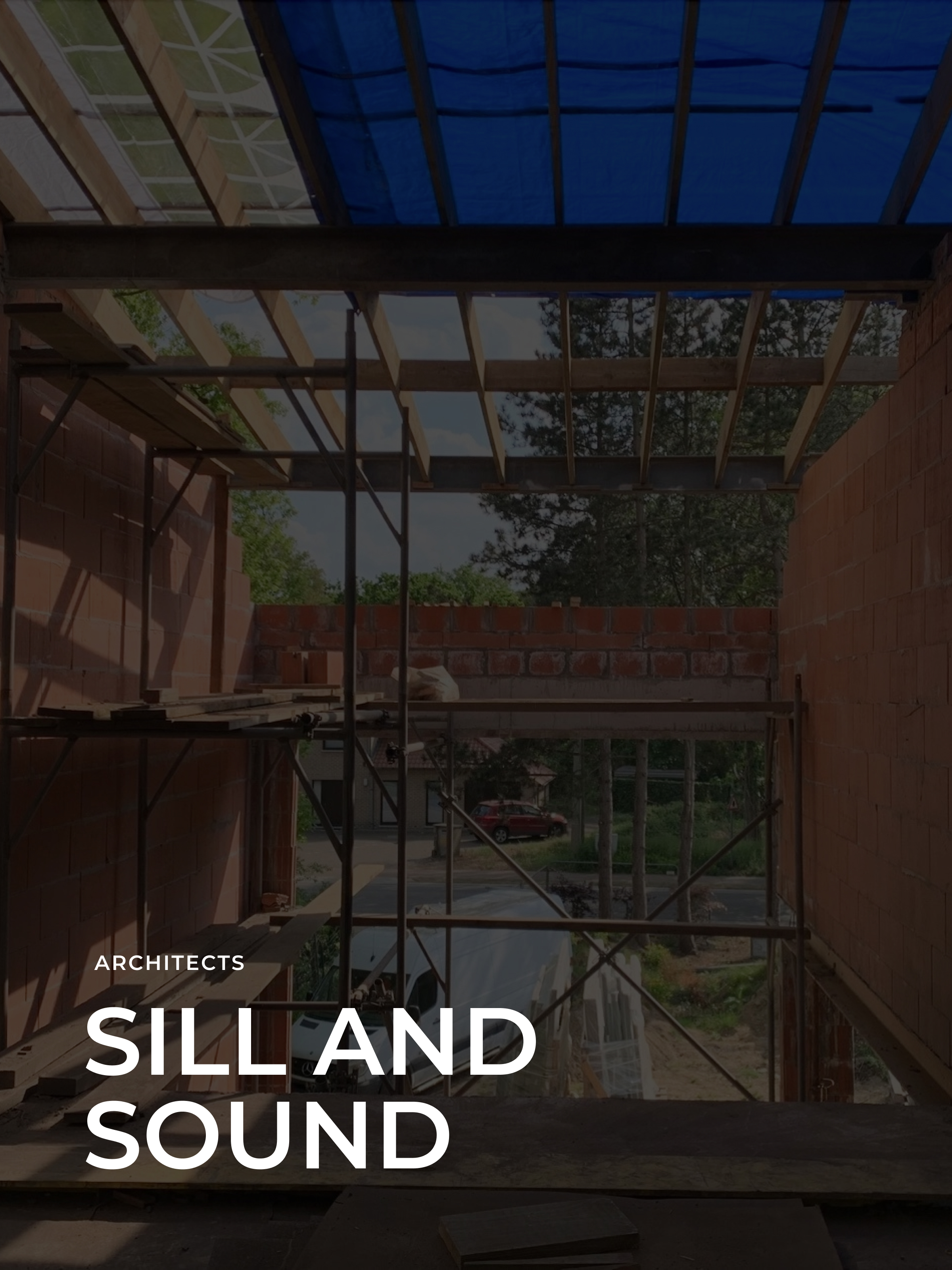
The full lockup applied in situ.
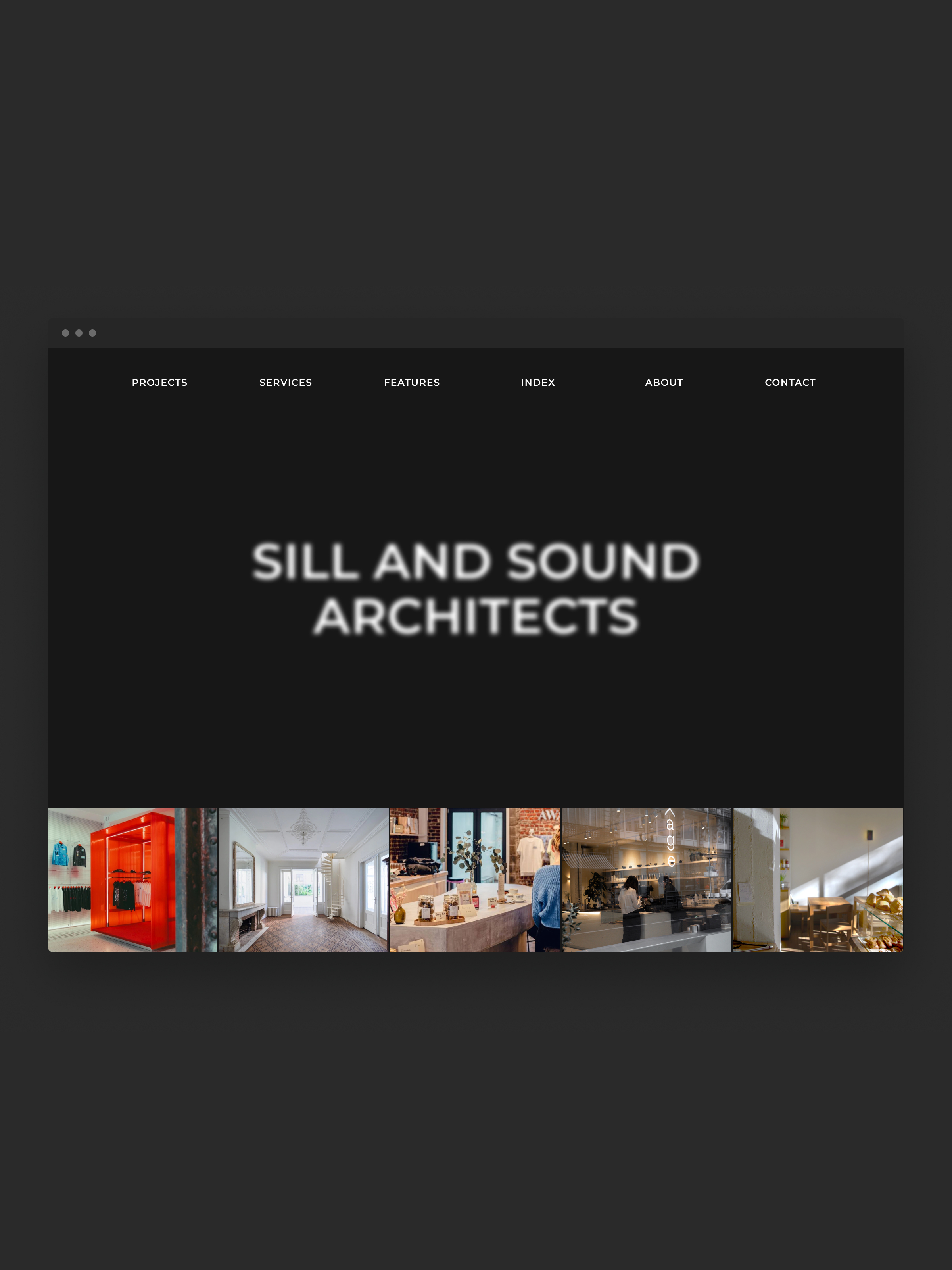
The homepage on desktop.
A PORTFOLIO IN MOTION
The new website was designed around Sill and Sound’s growing portfolio, keeping projects and imagery at the centre of the experience. Subtle hover effects and interactions add movement to what could otherwise feel like a static archive. Behind the scenes, the site is built around a flexible CMS, allowing the team to easily add and update projects themselves.
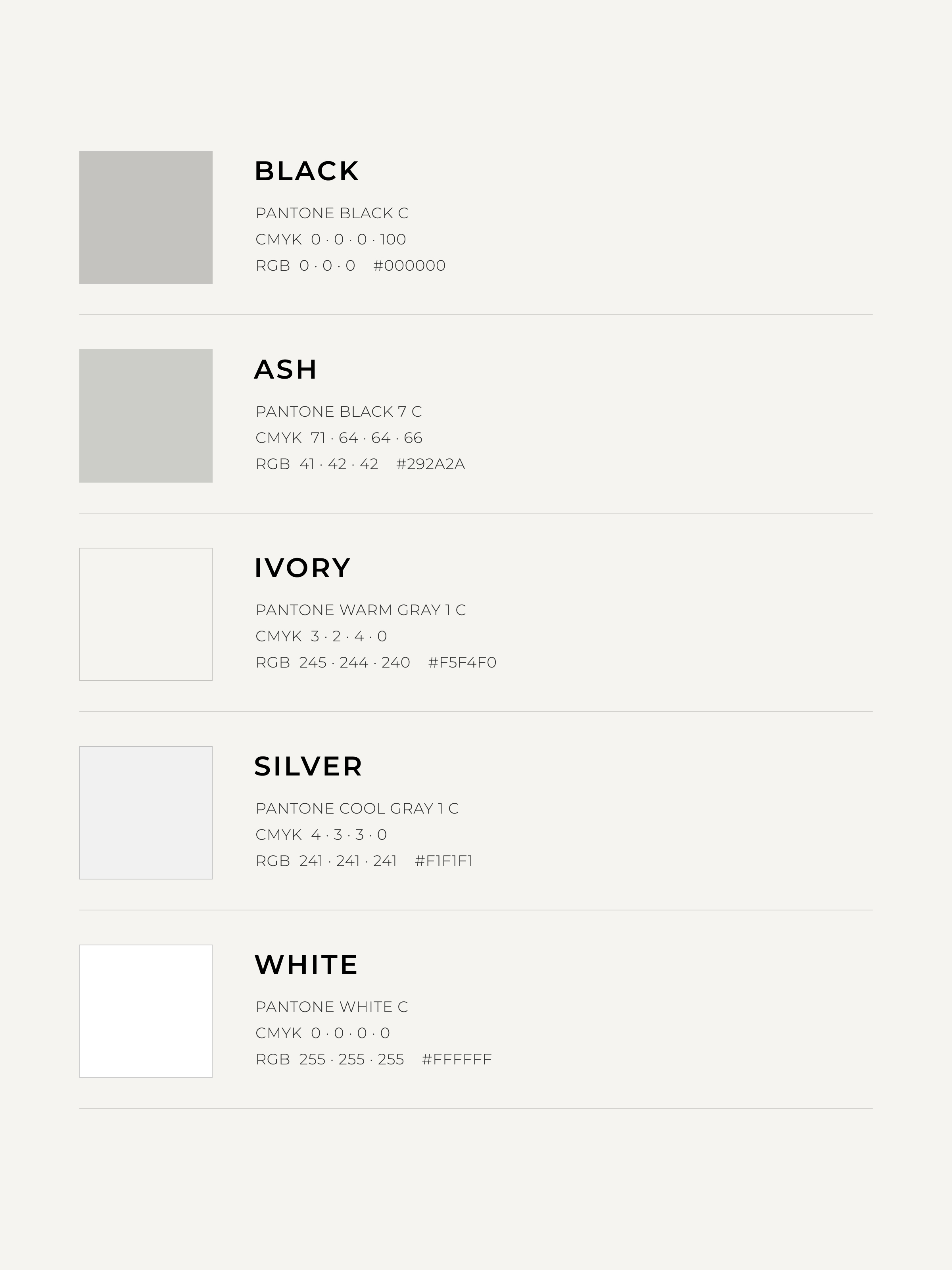
The monochrome palette: black, ash, ivory, silver and white.
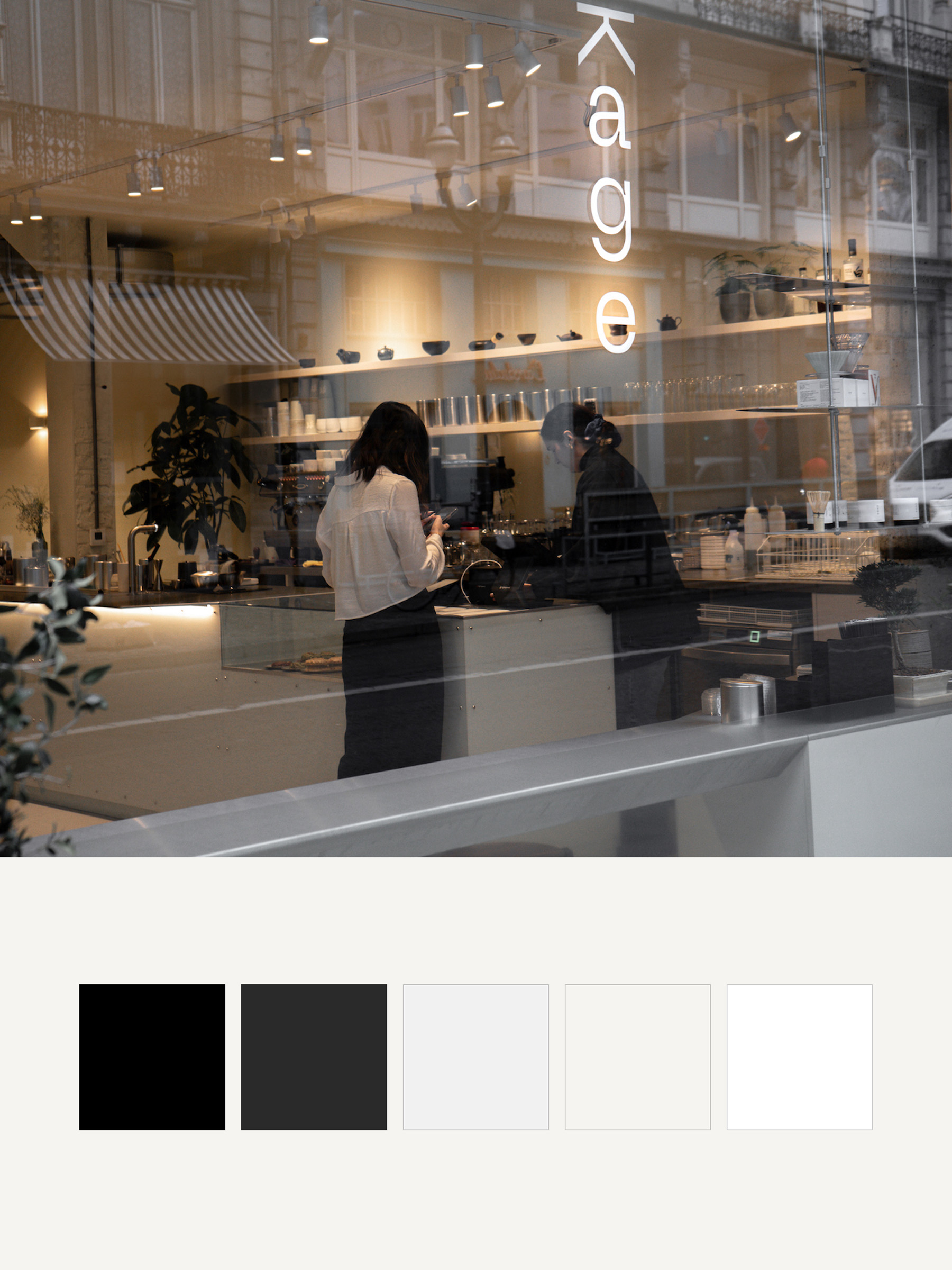
The palette tested against project photography.
Letterform detail from the logotype.
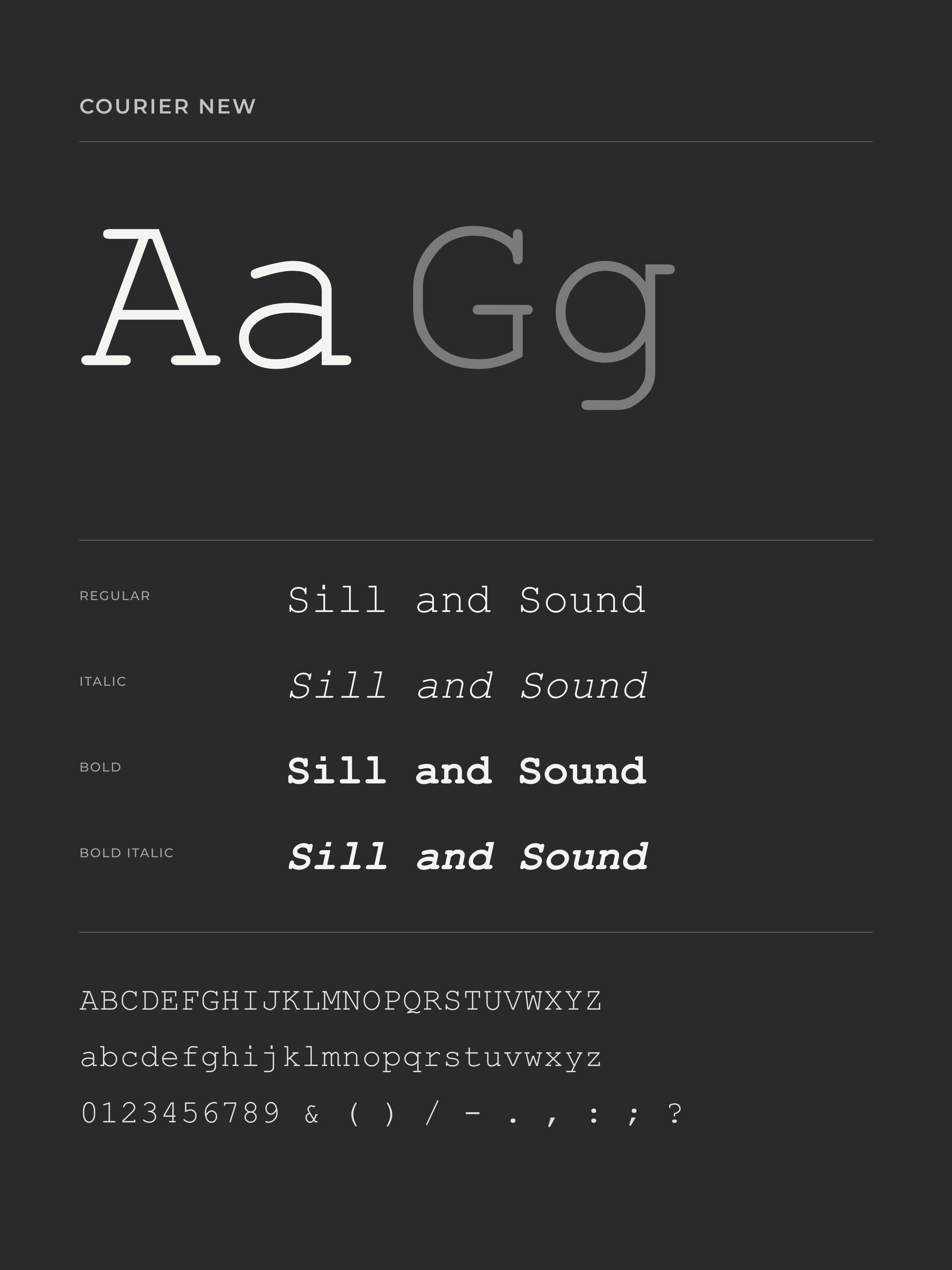
Courier New, reserved for headlines and editorial detail.
LETTING THE WORK LEAD
For an architecture studio with a diverse portfolio, the challenge was to build a brand that could hold different styles, scales and approaches without imposing a visual signature of its own. The result is a flexible identity and digital experience that stays deliberately in the background. It creates coherence while leaving space for every project to speak for itself.

Primary logotype reversed on project photography.
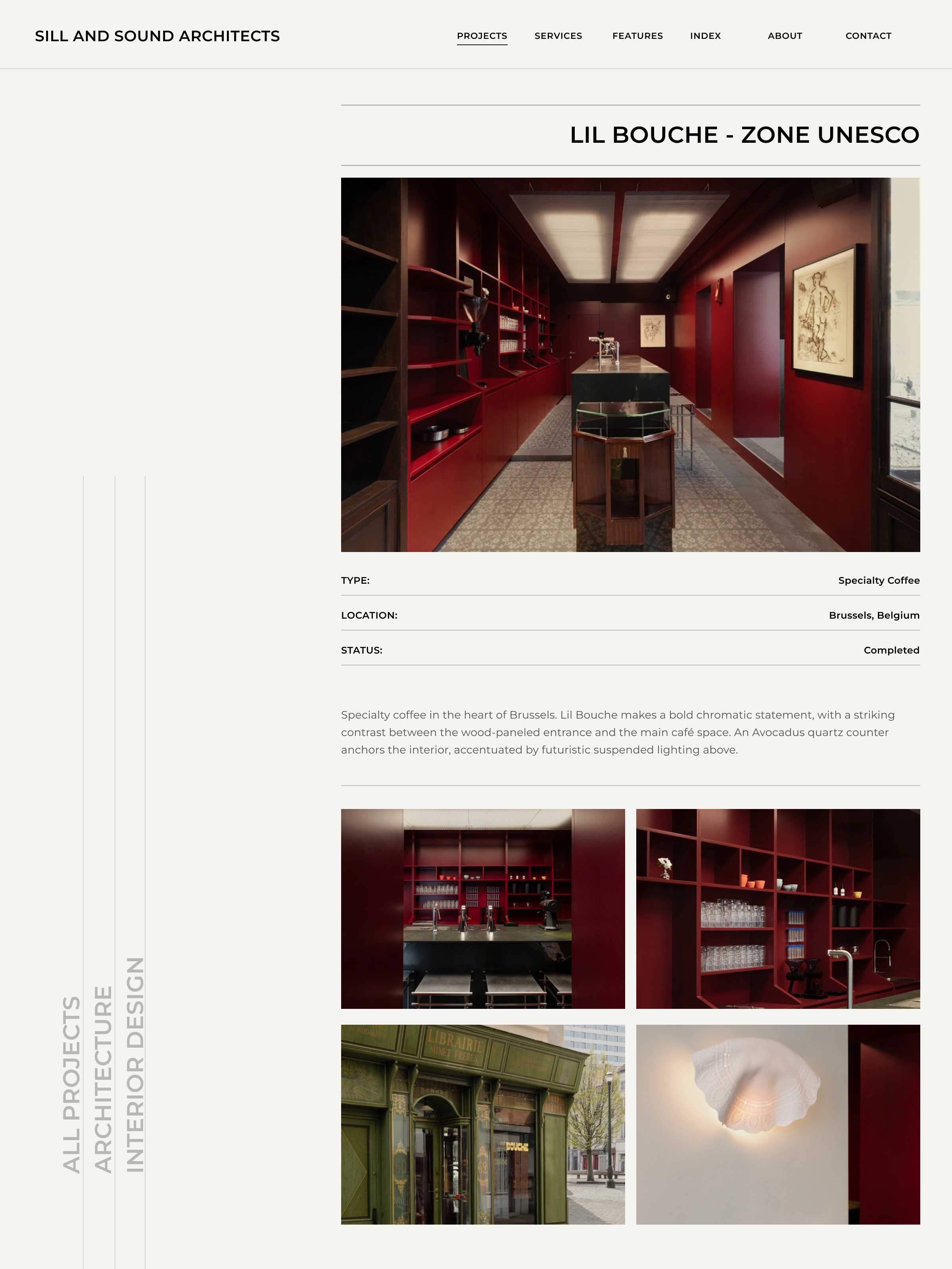
Project page layout — Lil Bouche, Zone UNESCO.
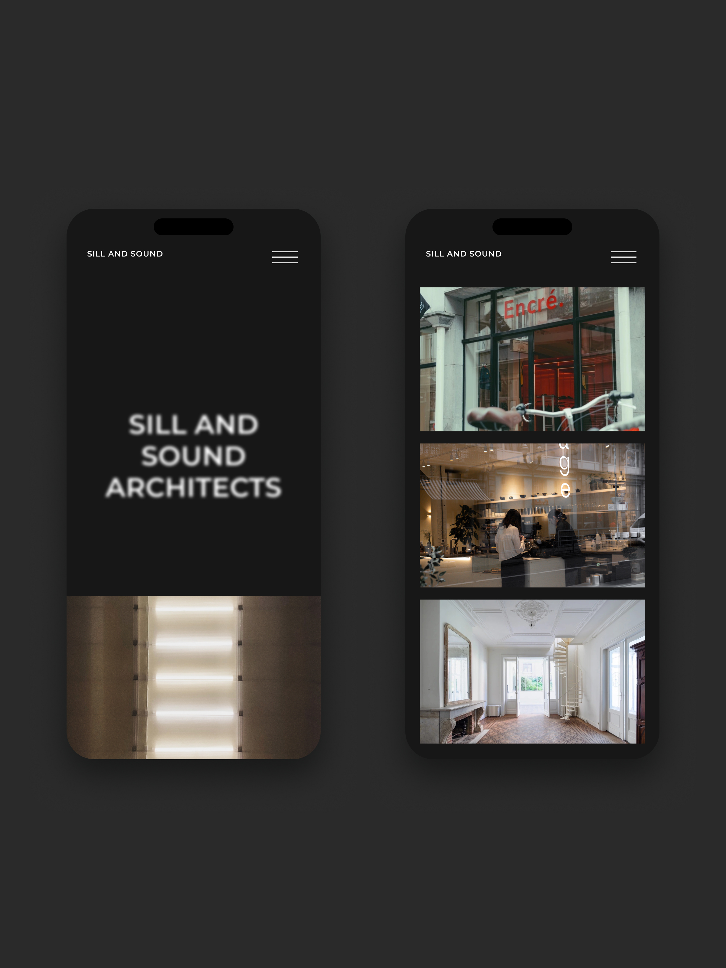
The responsive layout on mobile.
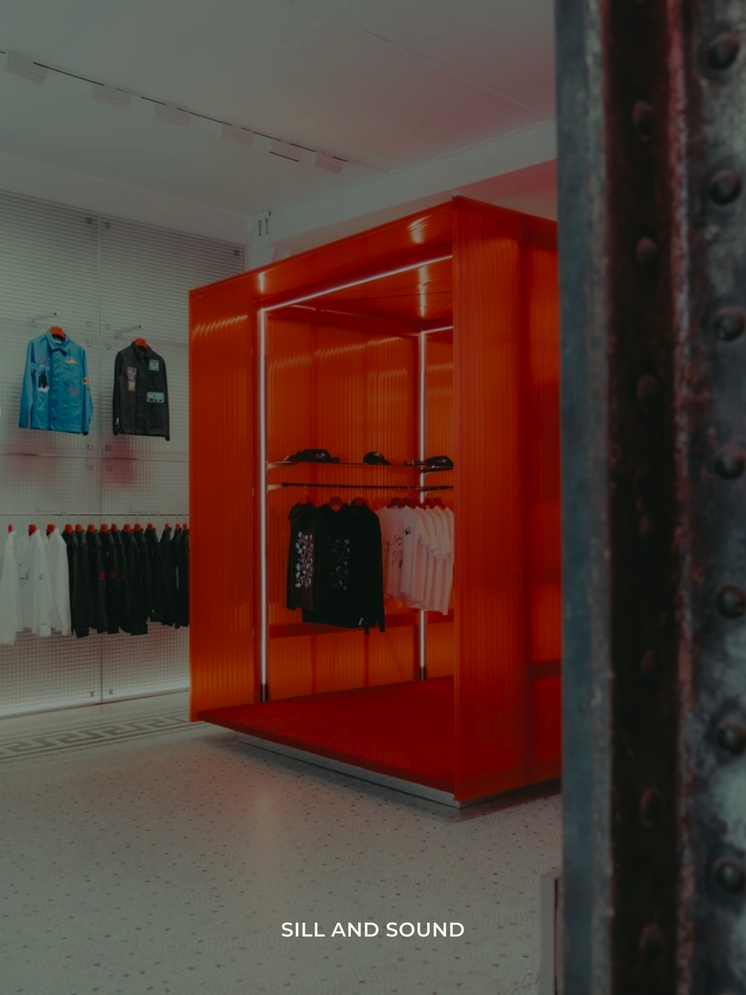
Projects and imagery at the core.
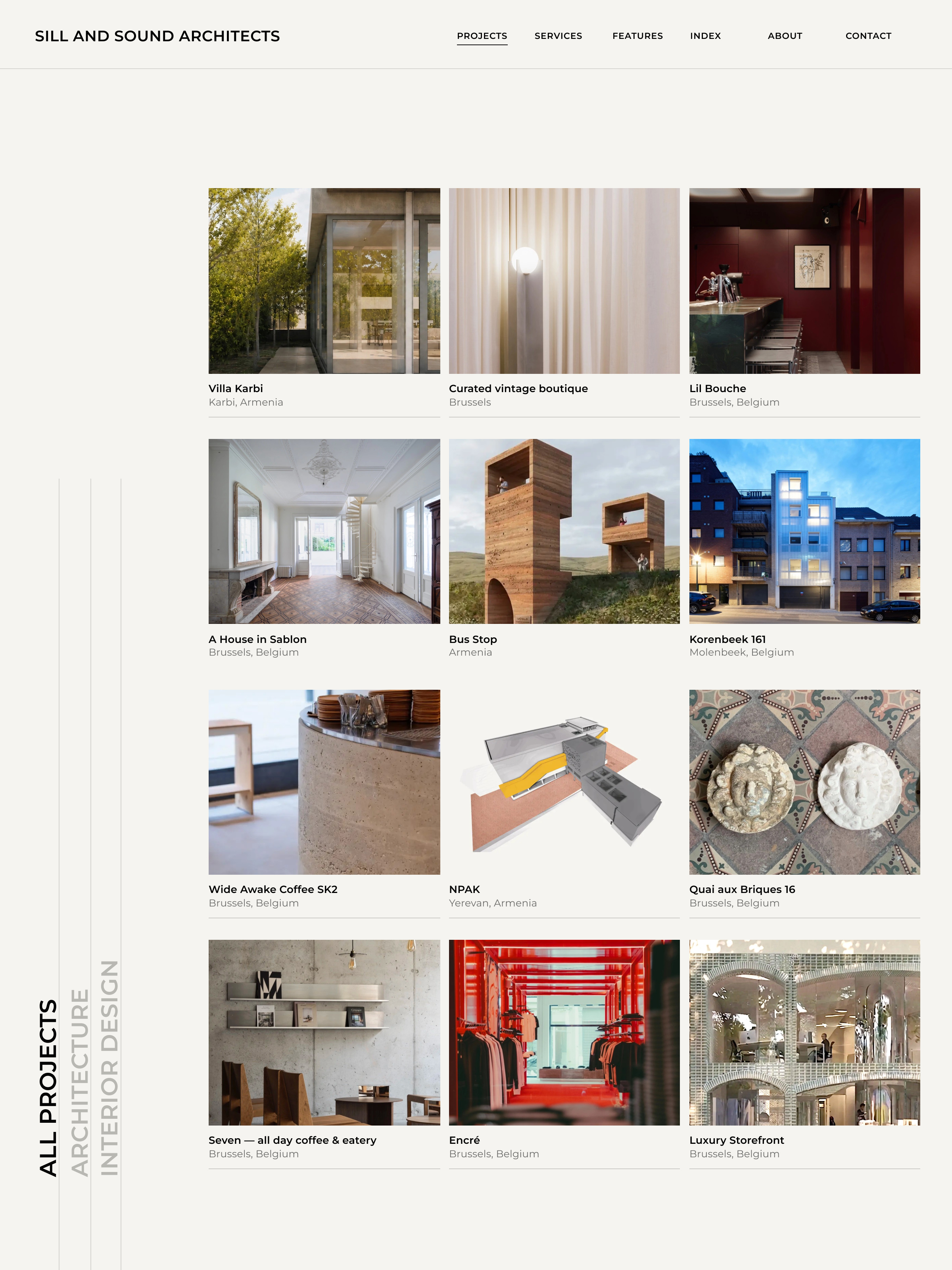
The projects index, built on a flexible CMS.
The blur-to-focus reveal that opens the homepage.
Brand Identity
Matti Verbanck
Website
Matti Verbanck, Lena Poels