
SOFTNESS MEETS STRENGTH
We created the original LYSS brand identity and built a visual foundation designed to grow with the brand. The logo combines a bold serif with a handwritten element, balancing strength and softness. We translated this into typography, photography, colour and art direction, then carried it into the website and ongoing communication. The result is a recognisable LYSS world with room to evolve.

The LYSS 2.0 bag, the store illustration printed on silver.
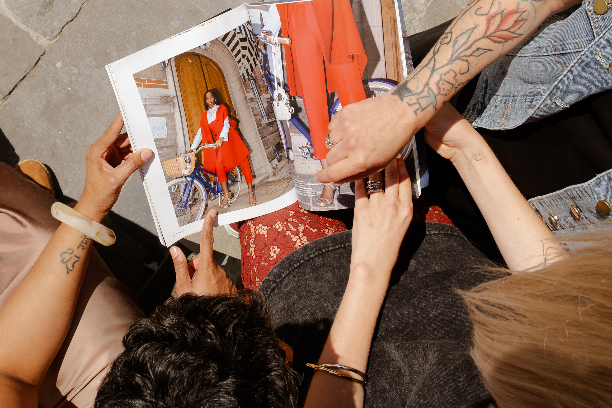
From the monthly content shoot.
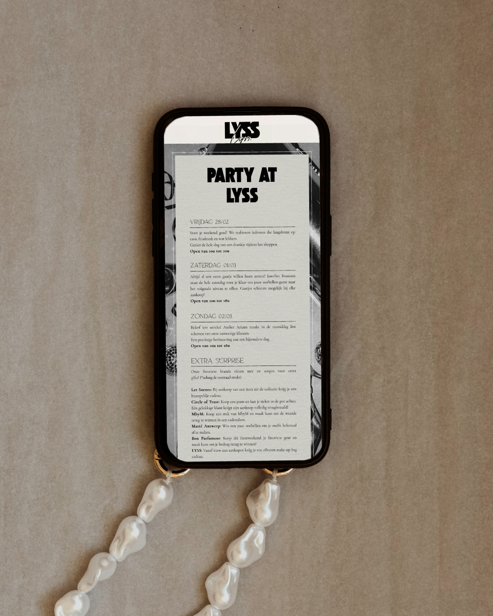
The anniversary programme, made for the phone.
COMMUNITY-BUILT
We brought the LYSS identity into the physical world through shopping bags, window designs and other brand applications. We also invited the community to shape the brand through the Design Your Own LYSS Bag competition. Two customer designs were selected and produced as canvas bags. For a period we managed LYSS’s social media as well, translating the brand identity into a consistent digital presence.

Two looks from the campaign shoot.

Gift-card bags: matte paper, transparent foil.
SILVER, BOLD AND PLAYFUL
For LYSS’s first anniversary, we pushed the established identity into a more expressive direction. Silver, bolder graphic elements and a party-inspired atmosphere gave the campaign a celebratory edge while keeping it recognisably LYSS. We developed the campaign video and visual direction as an extension of the existing brand, showing how an identity can evolve and become more unexpected without losing its core character.
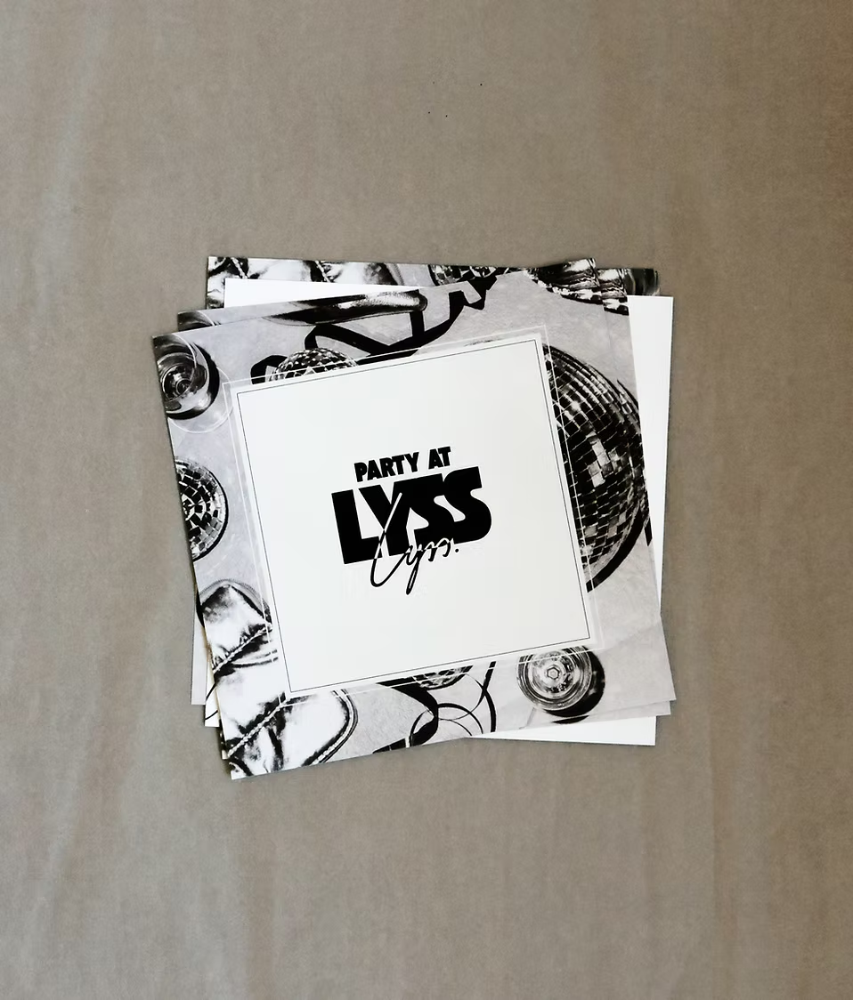
The anniversary invitation, in print.
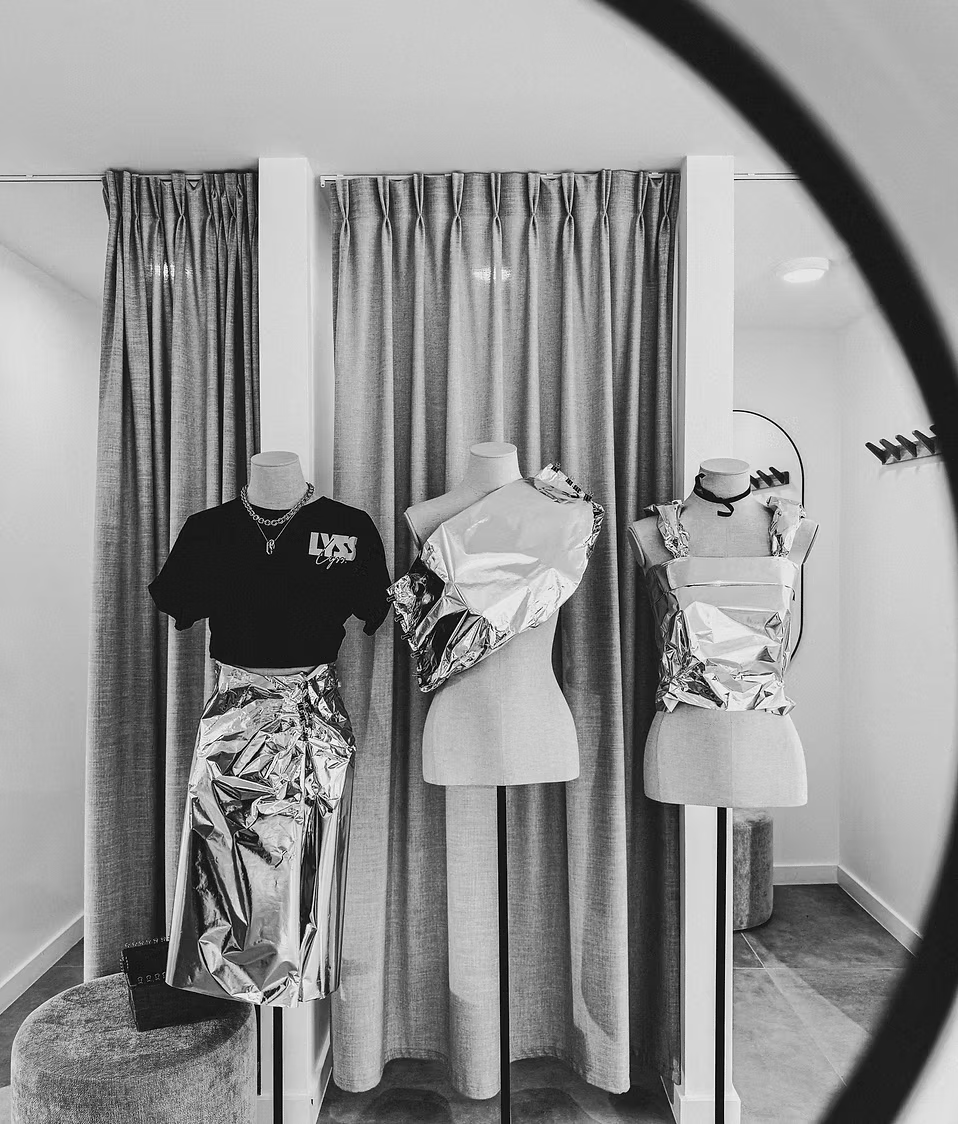
Silver-wrapped mannequins in the store.
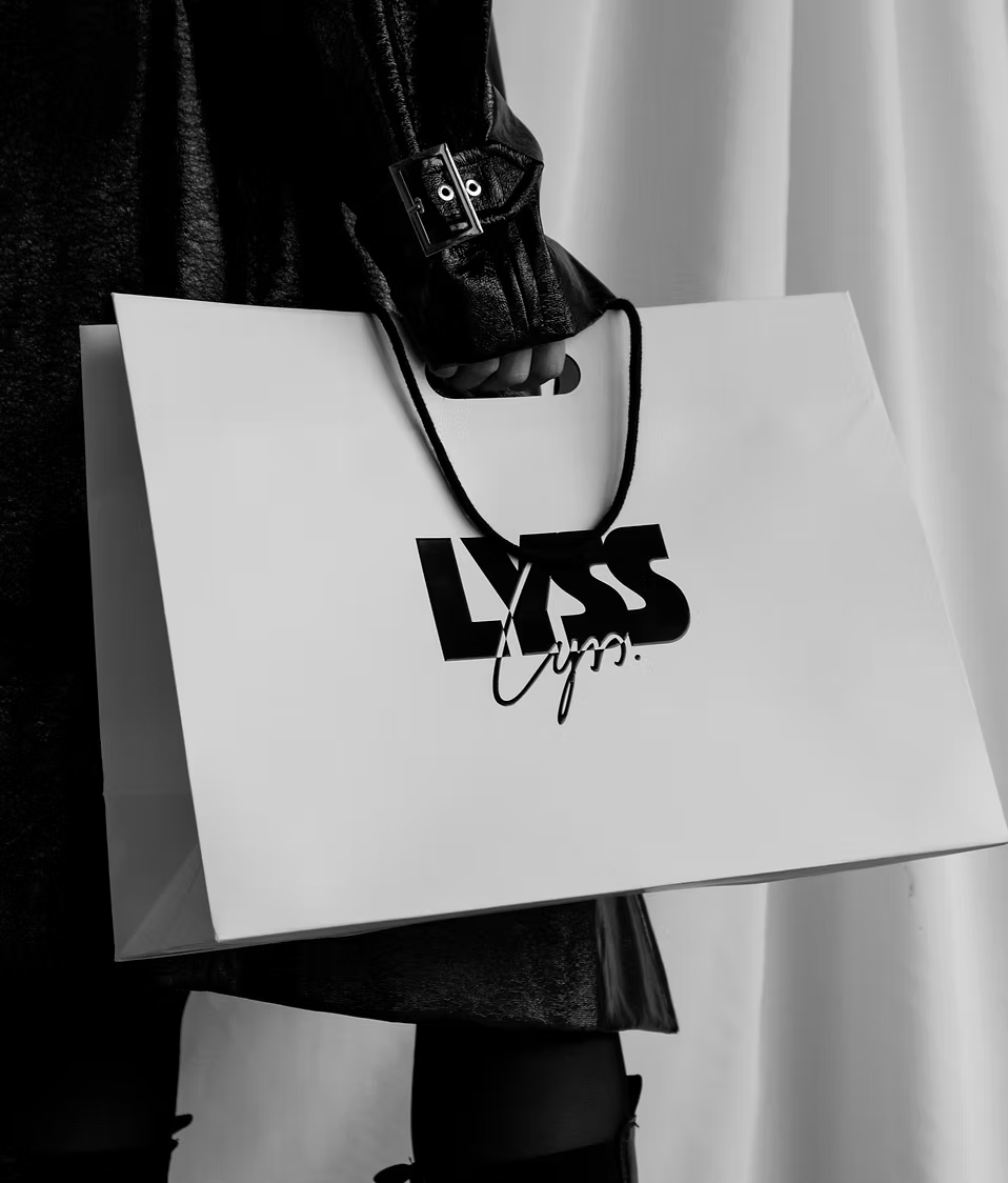
The shopping bag, carrying the full logo lockup.

The hand-drawn store, centre of the LYSS 2.0 campaign.
LYSS 2.0
When LYSS moved to a larger store in the same street, we created the visual language for its next chapter. A hand-drawn illustration of the new store became the centre of the campaign, supported by a new campaign video, silver shopping bag, gift-card bag, window design and signage. Reintroducing and extending the silver language made the move feel like a natural evolution: LYSS 2.0.
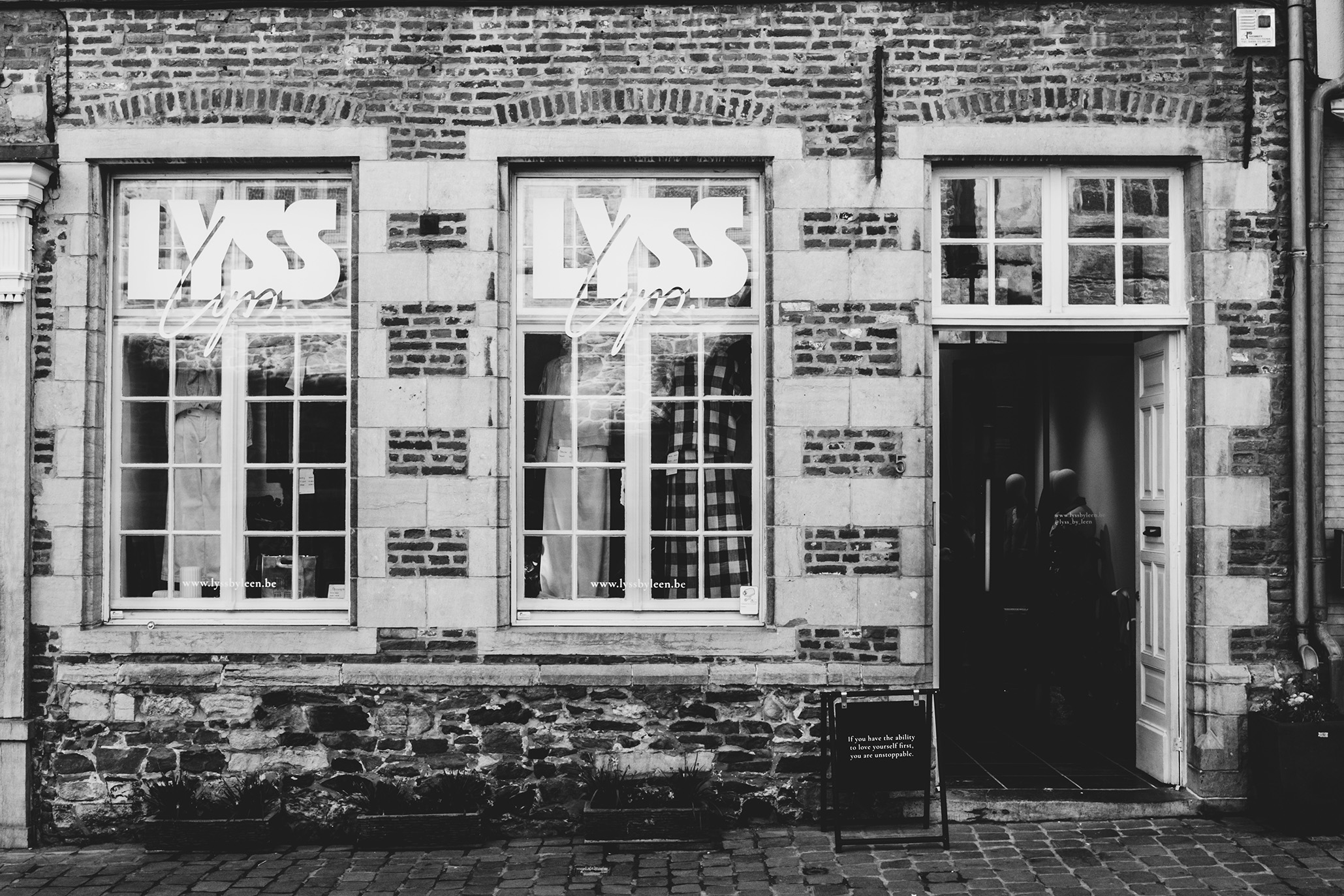
The new storefront, window graphics in place.
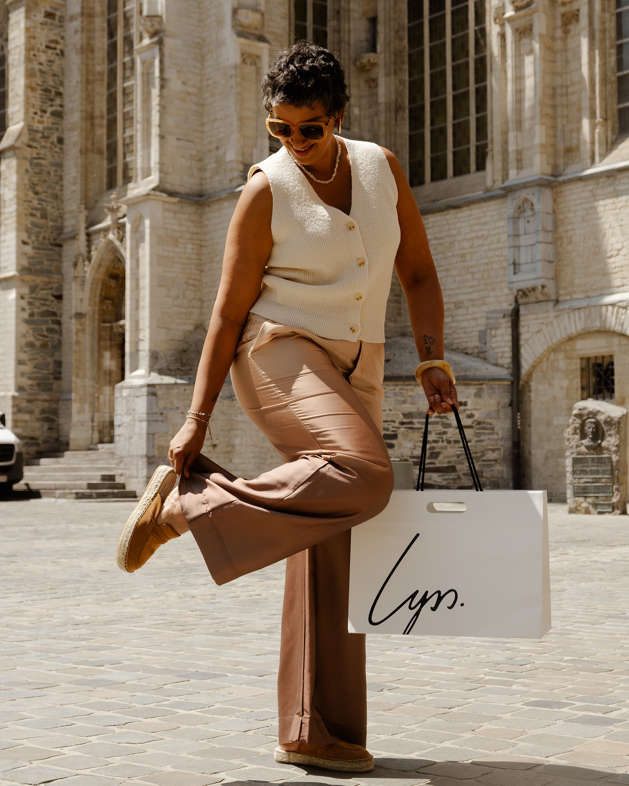
The shopping bag, out in the street.
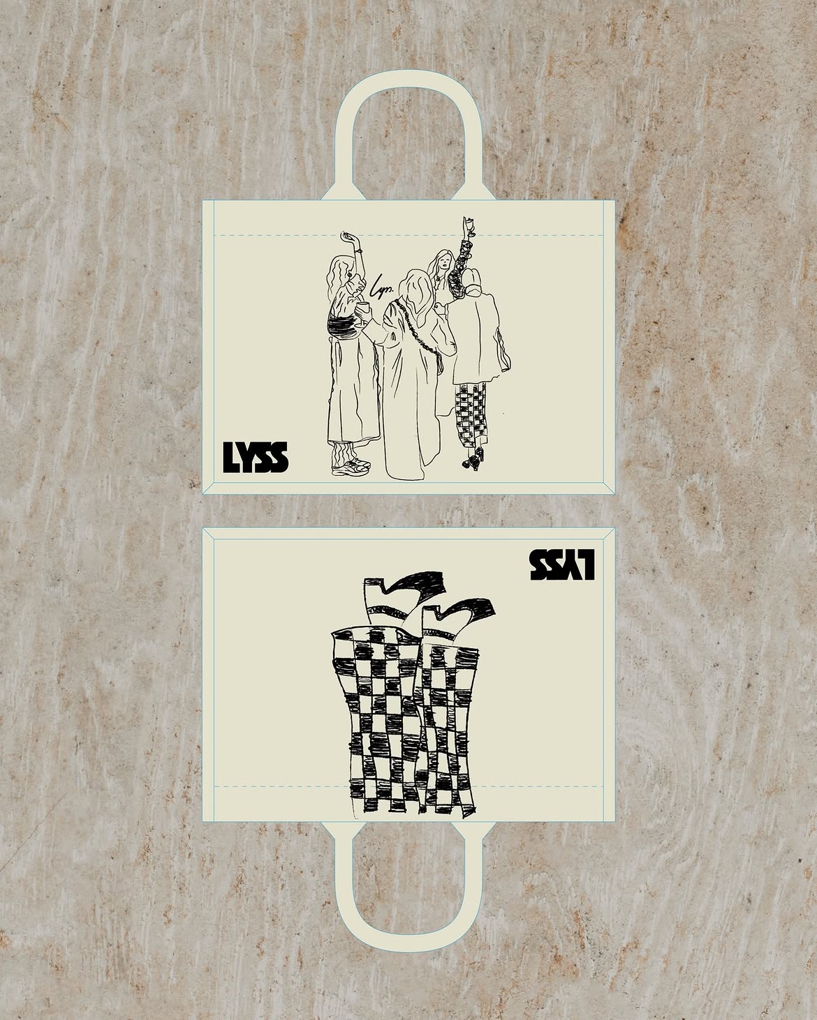
Community-designed canvas bags, laid out flat.
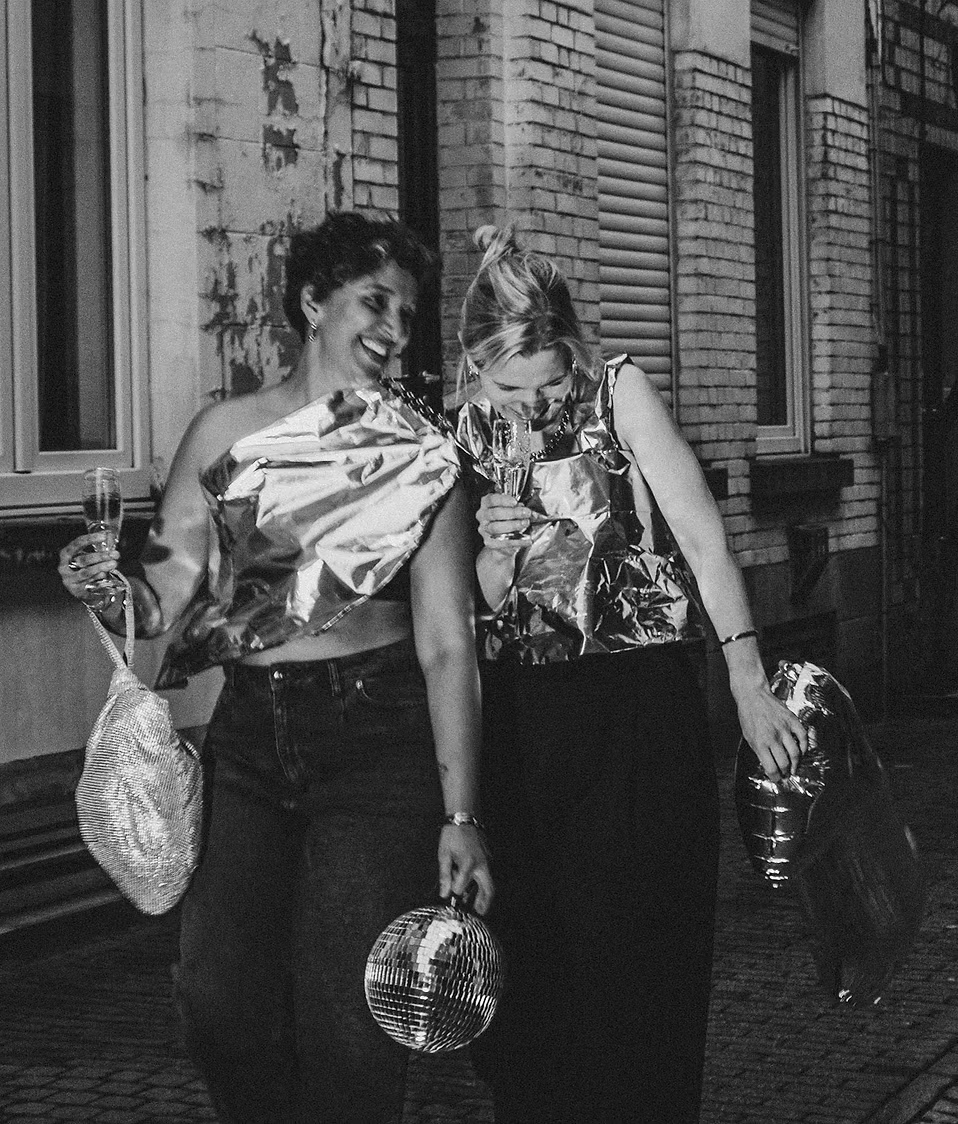
The silver anniversary campaign — photo and video.

The logotype: bold type crossed by a handwritten signature.

The VIP invitation for LYSS 2.0 — the line-up.
Creative Direction
Matti Verbanck
Brand Strategy
Camille Campisi
Graphic Design
Solena Greco
Photography
Freya De Vos
Website
Lena Poels, Matti Verbanck
Campaign Strategy
Camille Campisi
Videography
Simon Poels
Styling
Matti Verbanck
“A team that really took the load off my shoulders as a starting entrepreneur! What more could you need? From the very start of Lyss, Matti has guided us with her knowledge and experience, helping us make conscious decisions and work logically in building our identity, brand, visuals, store, and more. Every step of the way, they thought along with us and challenged us. And even now, I can focus on the store and collections while Matti and her team continue to make sure everything fits together perfectly! A very pleasant collaboration!”
LYSS