
THE EVOLUTION
We started by taking over the communication for Fosbury & Sons’ Alfons and Boitsfort locations for one year, building content, campaigns and a consistent presence around both spaces. Over time, the work revealed an opportunity to give Alfons a stronger identity of its own. We then shifted our focus towards building Alfons as a distinct destination within the Fosbury & Sons family.
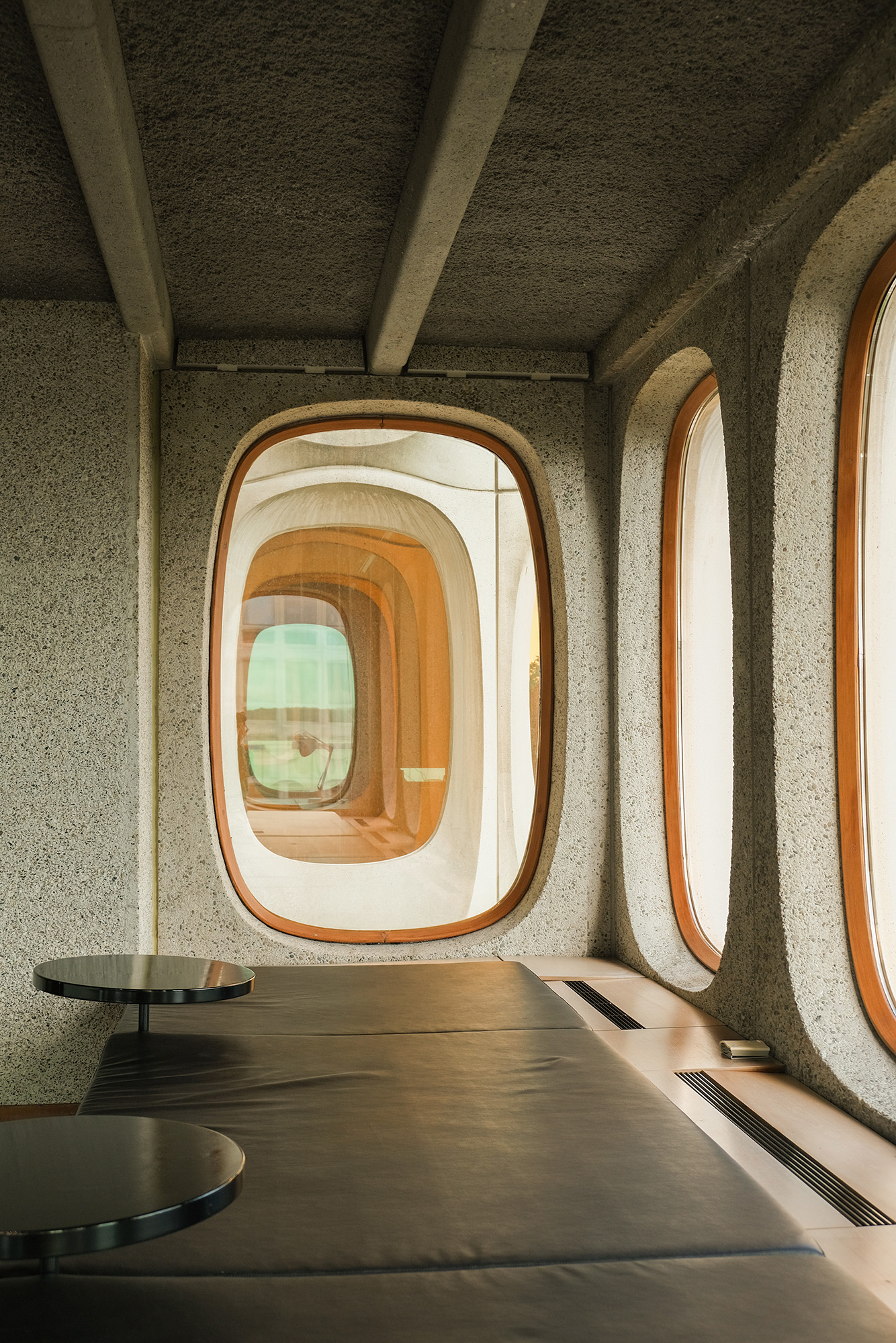
The architecture: concrete, curves and daylight.
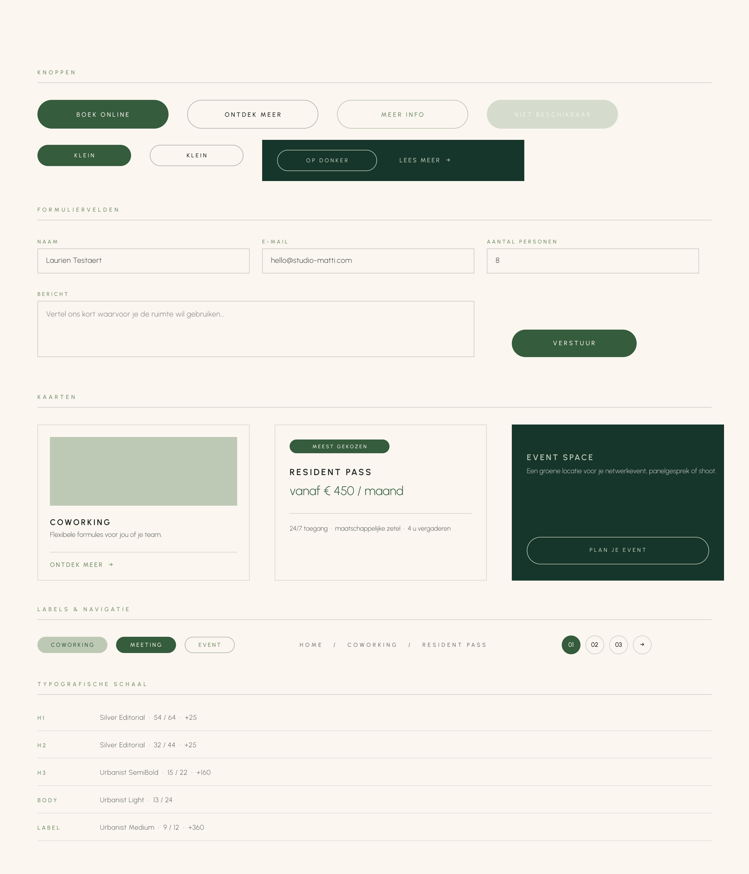
The UI system: buttons, forms and cards.
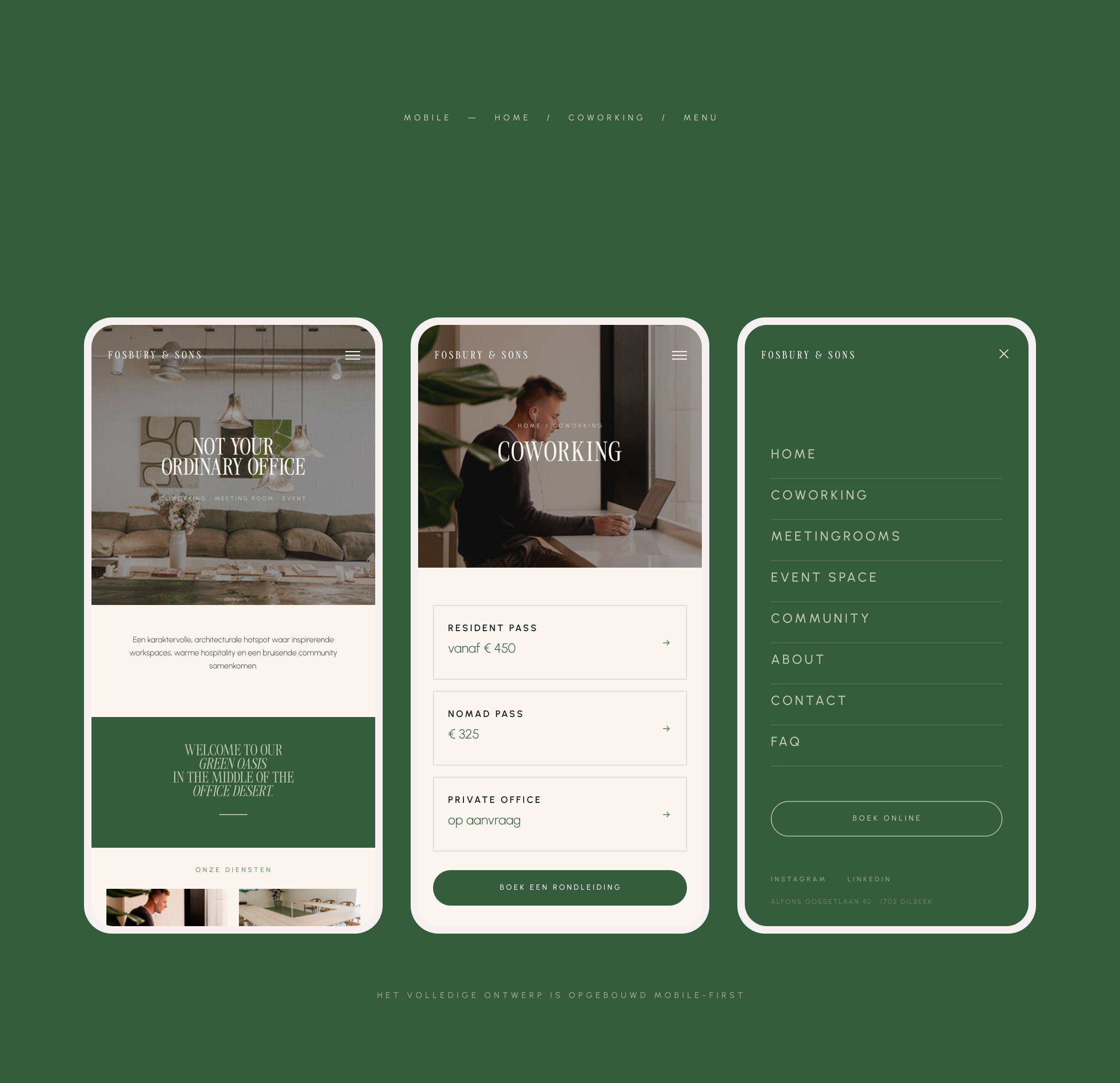
The design, built mobile first.
DEFINING ALFONS
We started with a full communication takeover across both locations, covering brand strategy, campaigns, social media, content creation and content shoots. After the first year, we focused entirely on Alfons, developing a new visual identity and brand positioning, followed by a complete redesign of its website. The new identity was built around the character of the space itself: its architecture, greenery, warm materials and sense of community.
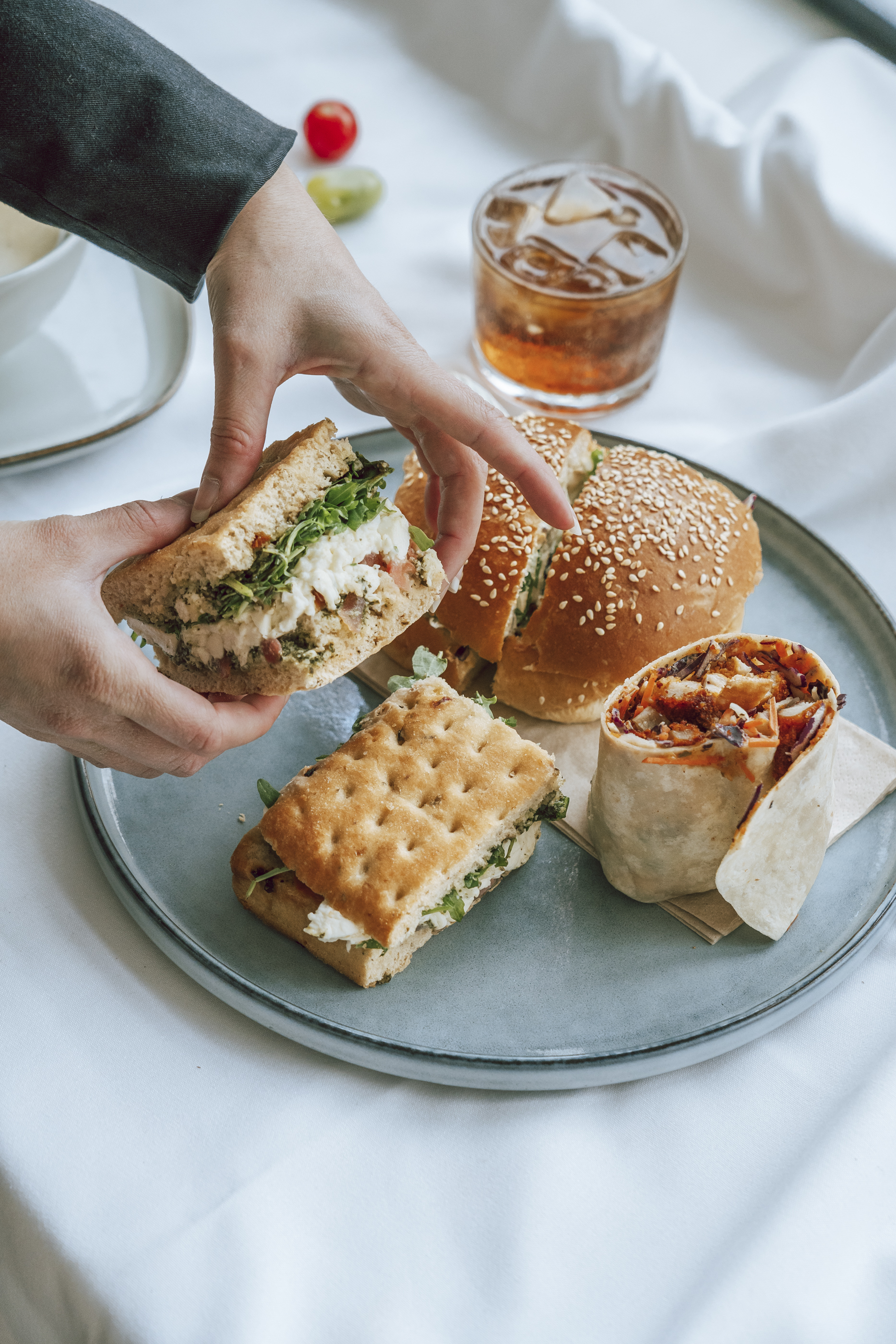
Lunch, from one of the content shoots.
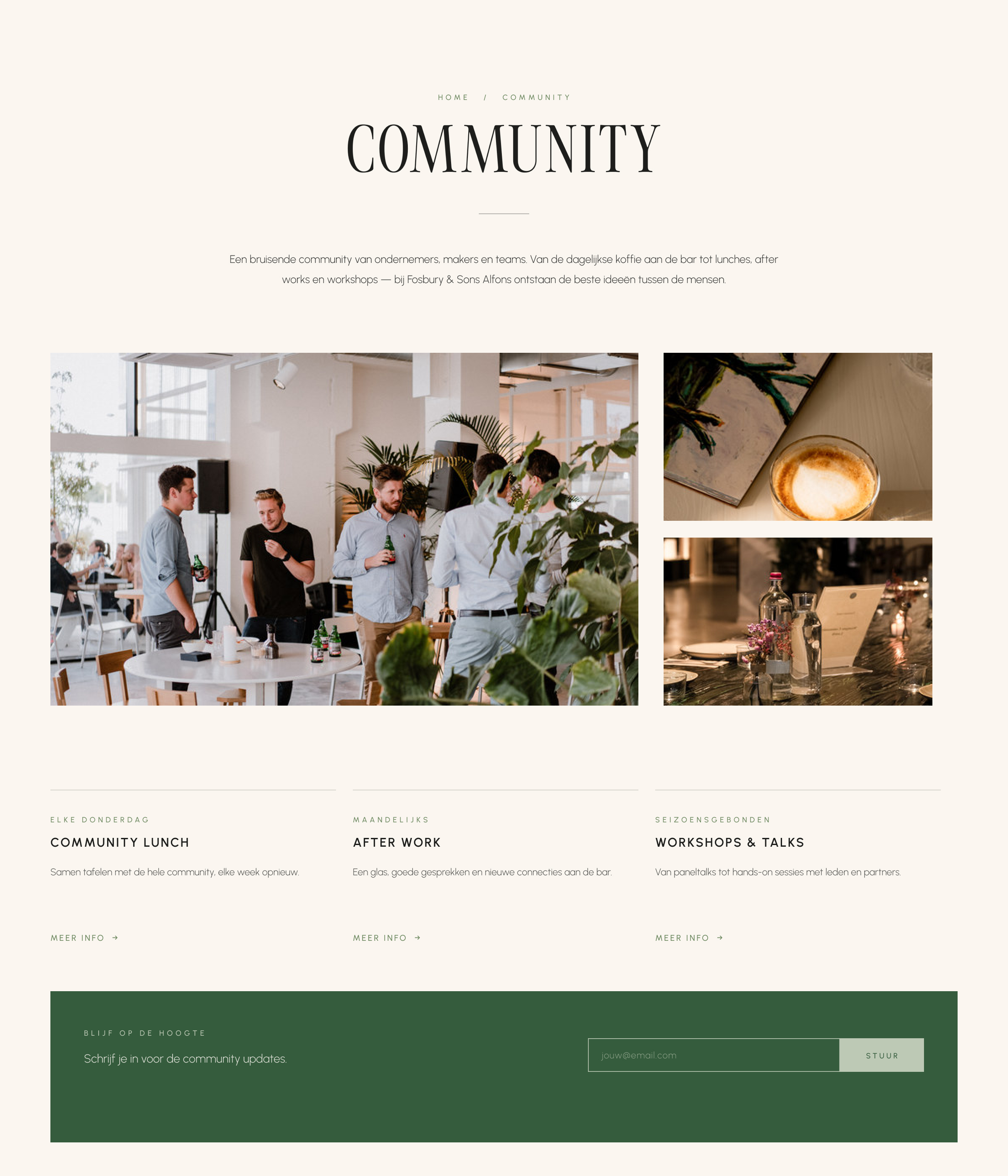
The community page: lunches, after work, workshops.
ARCHITECTURE MEETS IDENTITY
For Alfons, we created a visual world that feels editorial, architectural and contemporary, combining natural greens, warm walnut tones, crisp neutrals and distinctive typographic and graphic elements. The identity was designed to be more than a static brand system — it became a flexible language for campaigns, social content, photography and the digital experience, giving very different stories a recognisable Alfons signature.
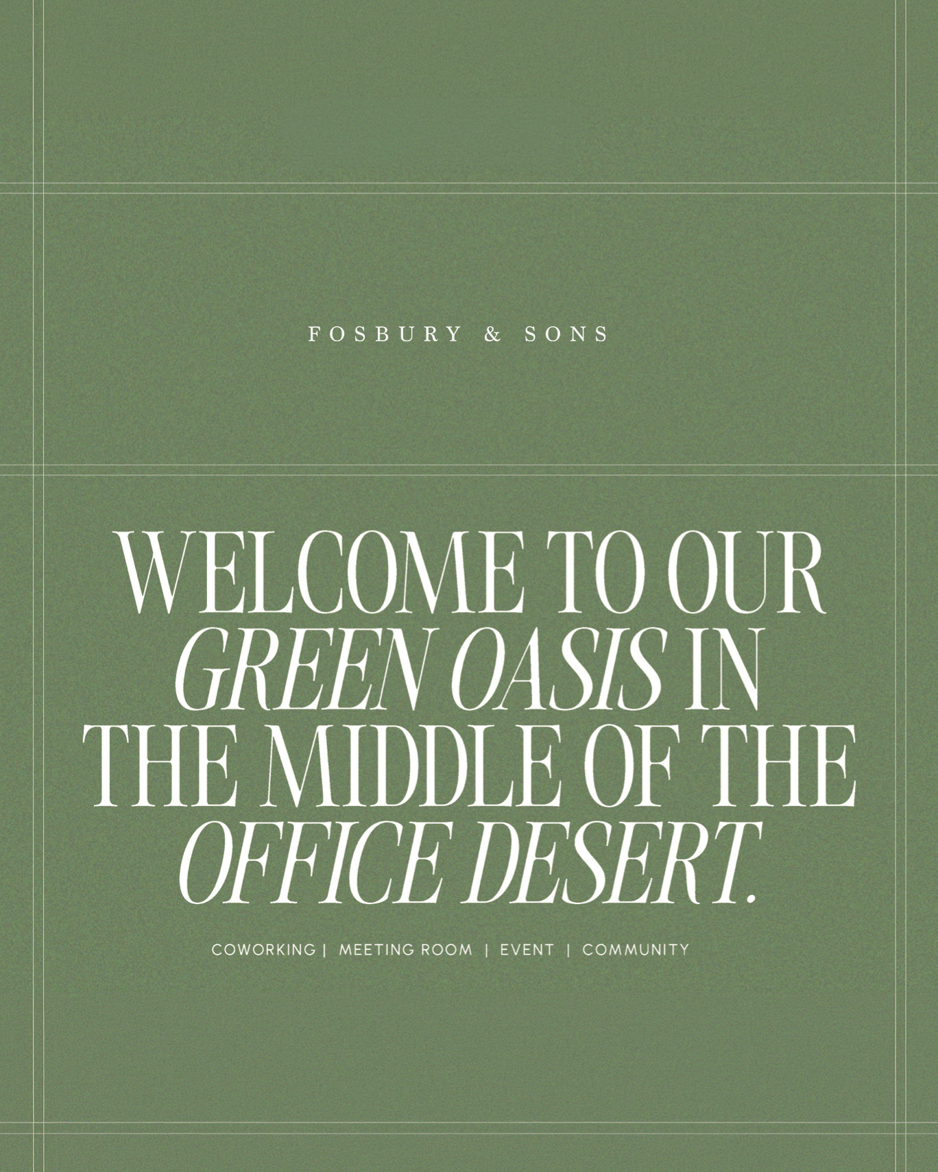
The campaign line: a green oasis in the office desert.
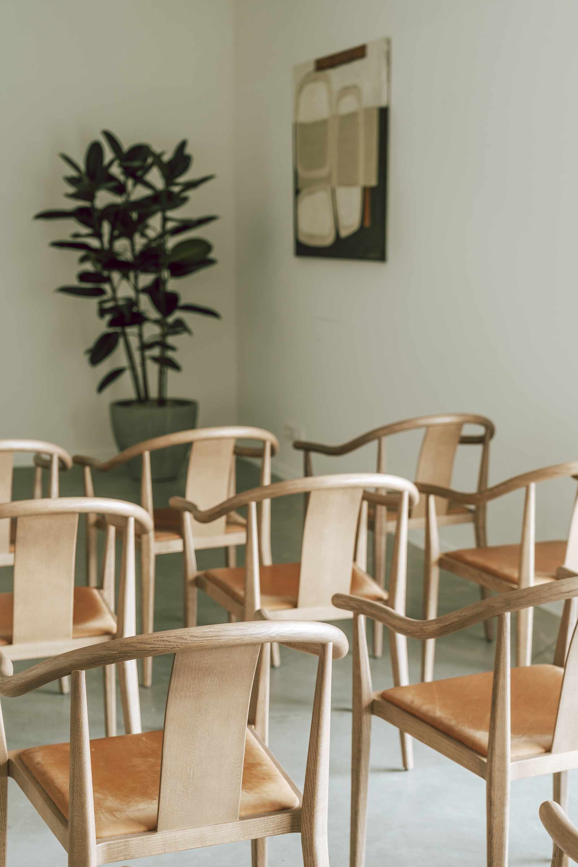
Alfons ⎯ Wood, leather and greenery in the space.
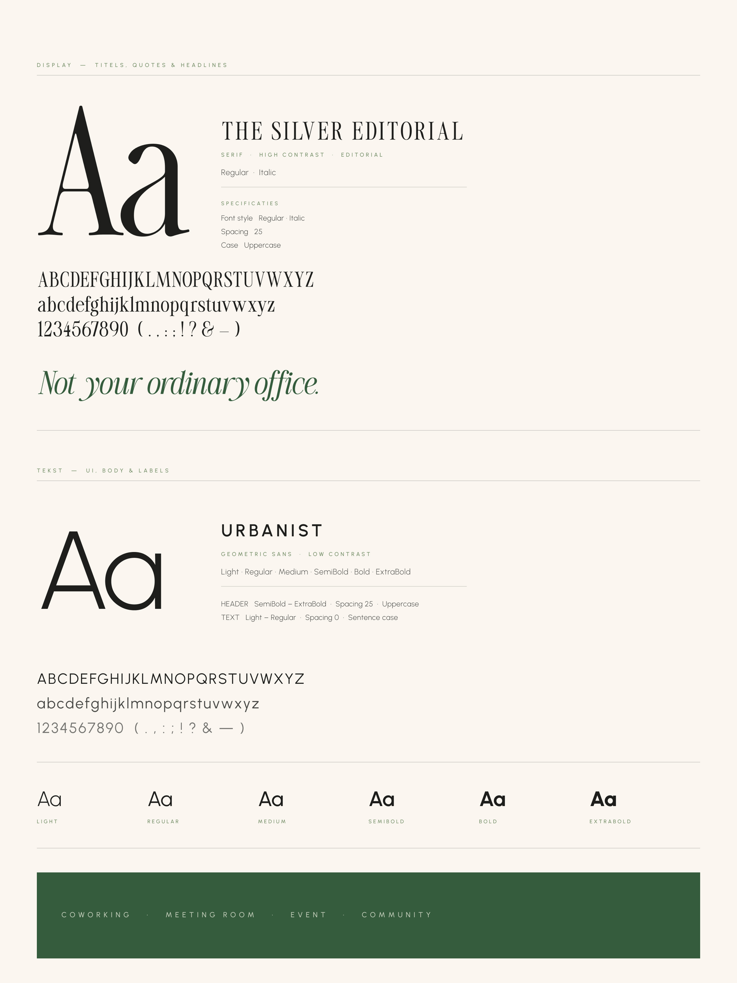
The Silver Editorial and Urbanist, paired.

Tone of voice and photography, side by side.
A DESTINATION OF ITS OWN
For Alfons, the work evolved from communication into full brand building. We developed a new identity, positioning and website that reflect the character of the space — its architecture, greenery, warmth and sense of community. What began as a one-year communication takeover became a more complete brand system, giving Alfons a recognisable personality and a clearer place within the wider Fosbury & Sons world.
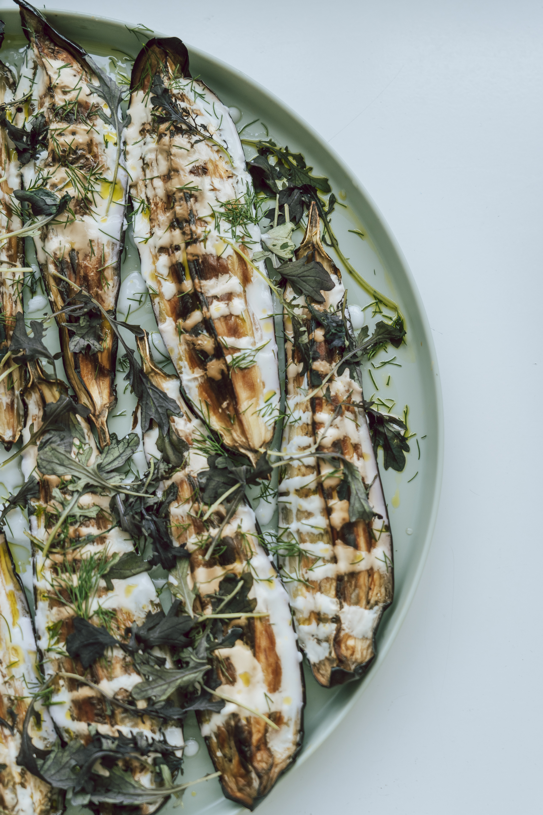
Food photography for the social feed.
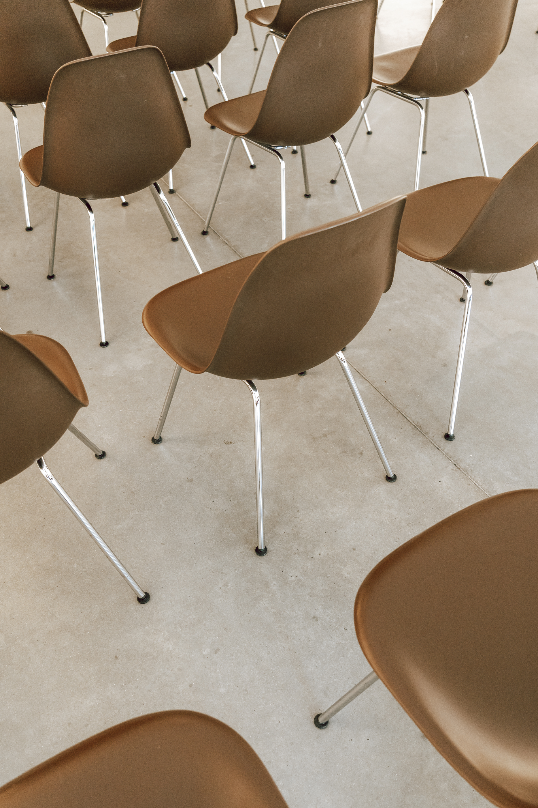
The photographic language: close, graphic, editorial.
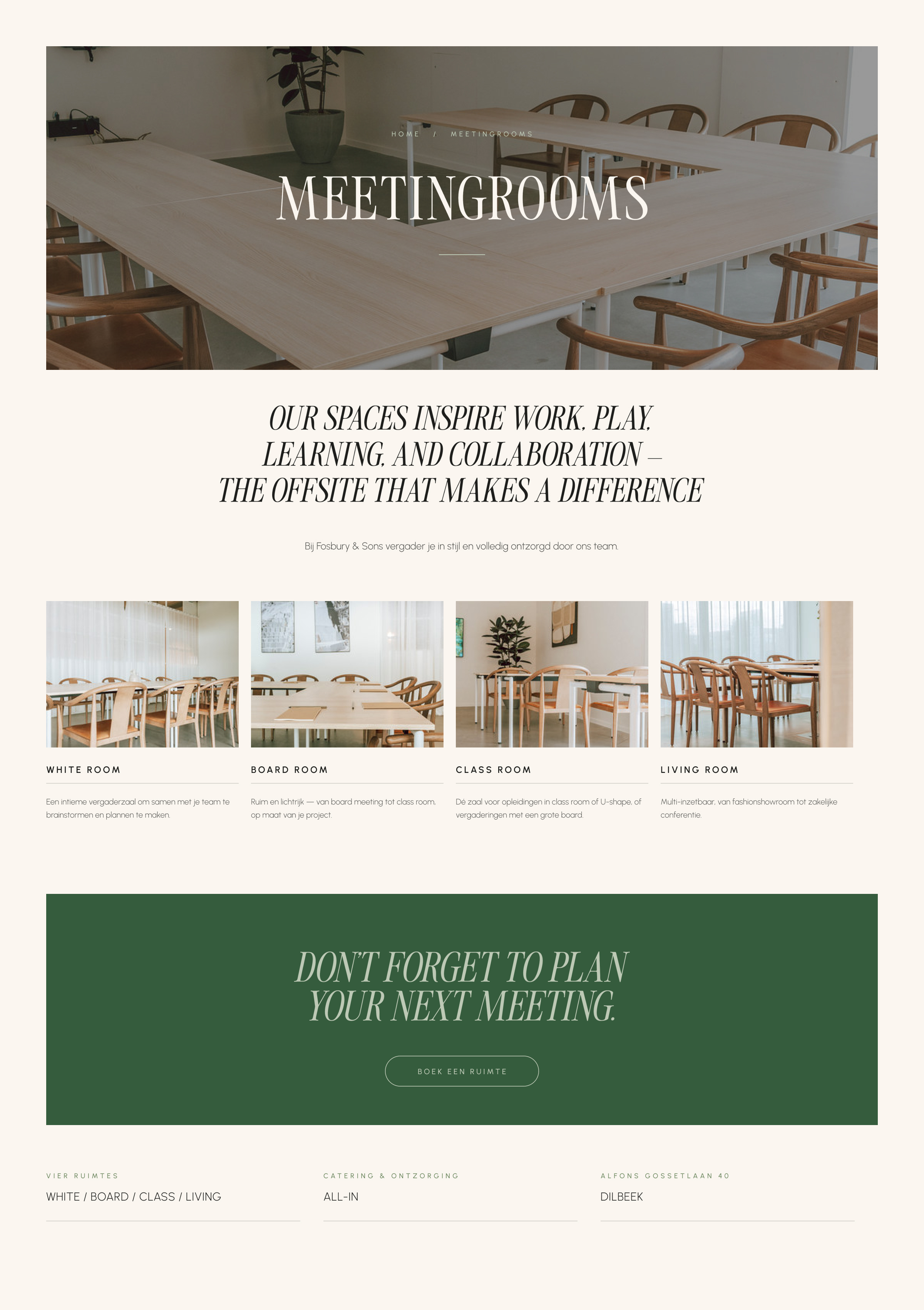
The meeting rooms page: White, Board, Class and Living.
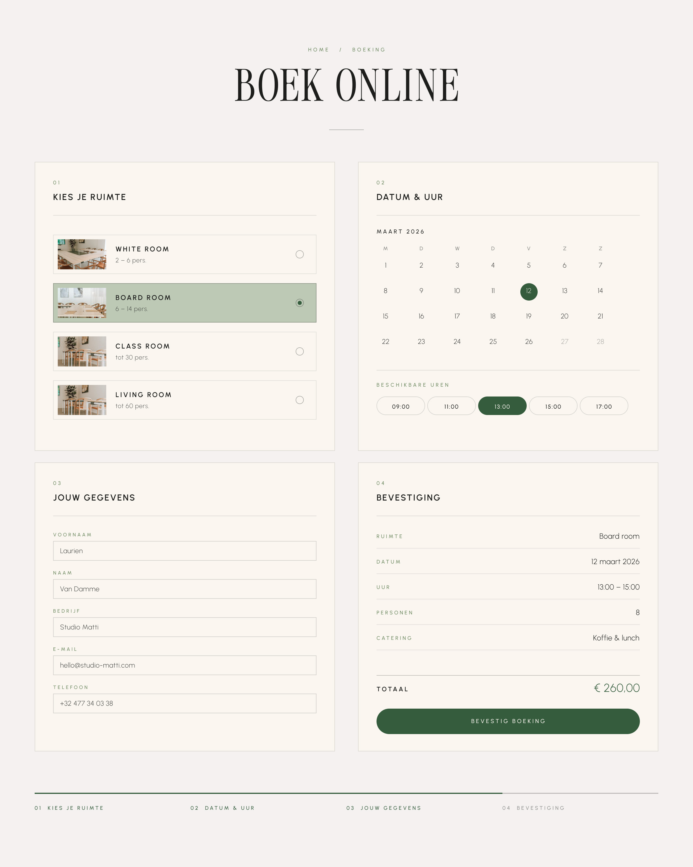
The booking flow, from room to confirmation.
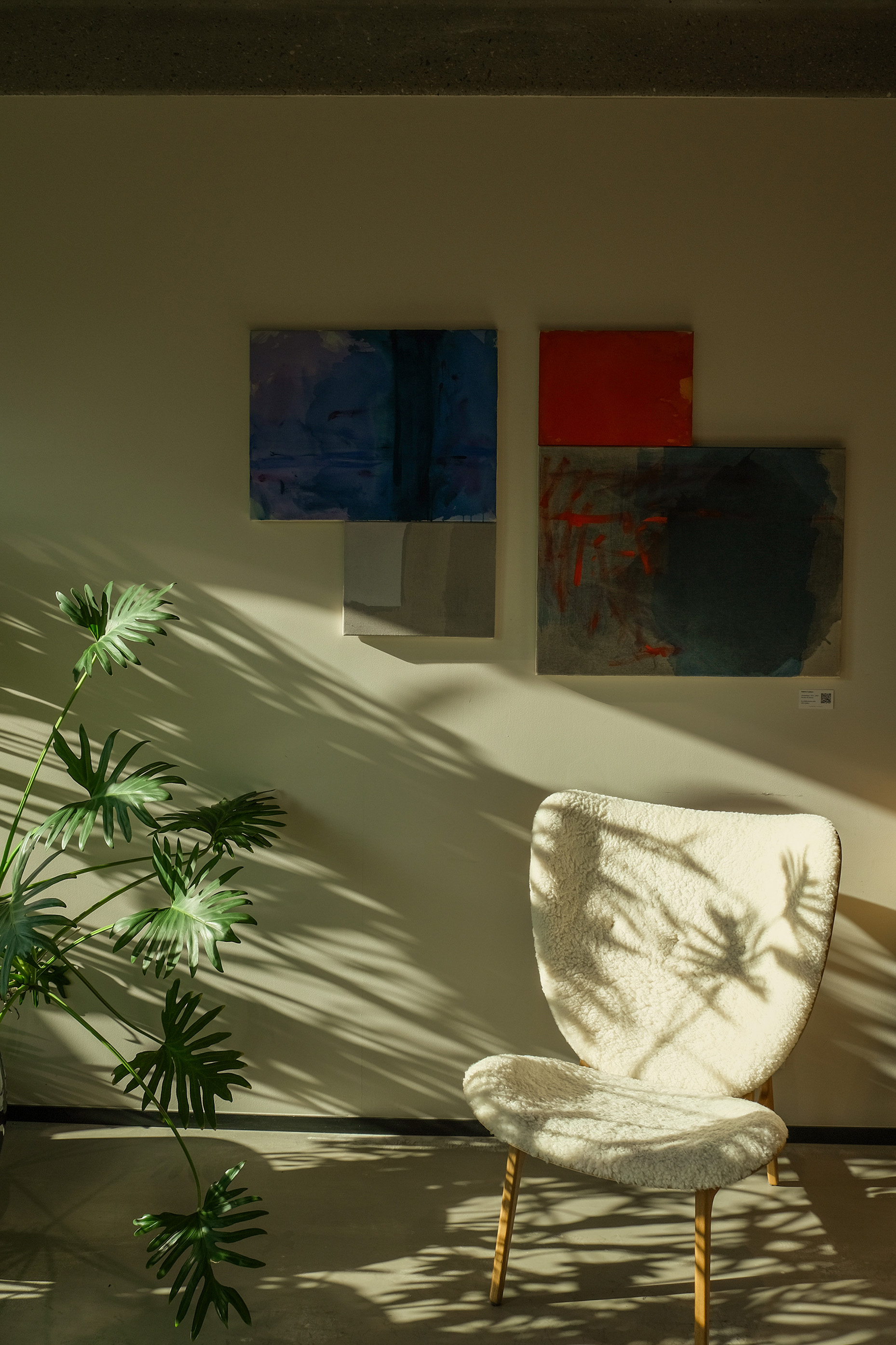
Boitsfort ⎯ Afternoon light and plant shadows.
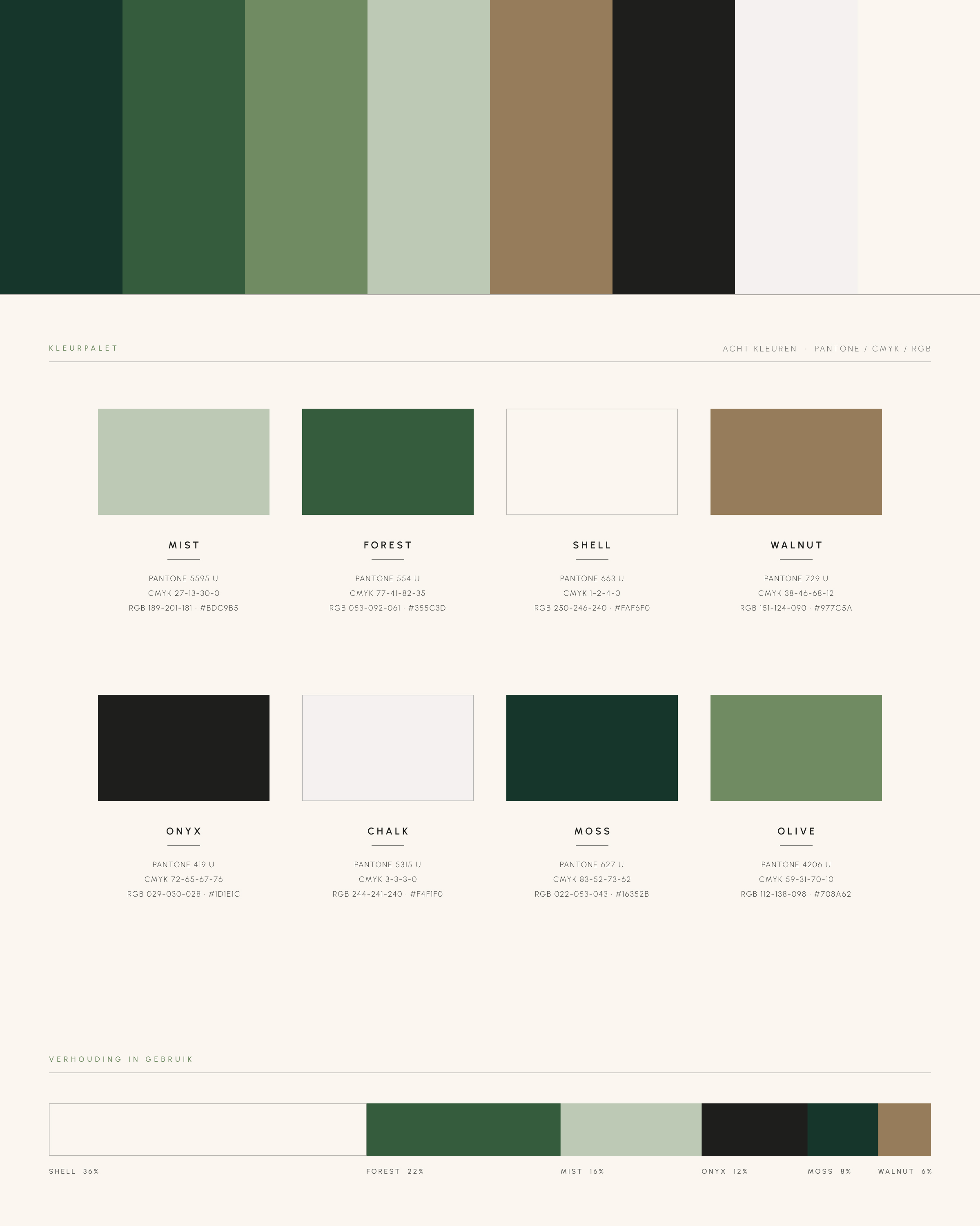
The colour palette: mist, forest, shell and walnut.
Brand Identity
Lena Poels, Elisabeth Adons
Brand Strategy
Camille Campisi
Website
Lena Poels
Photography
Axelle Boileau
Campaign Strategy
Camille Campisi
Videography
Simon Poels
Lead Generation
Sam Van Reepingen
“We love working with Studio Matti for our marketing across social media! The team is very hands-on, flexible and works in a personal way. They are always ready to work and think pro-actively together with us. They do not only provide a great and easy-to-follow social media planning, but also a monthly reporting and great SEO and SEA management. We would recommend!”
Fosbury & Sons